
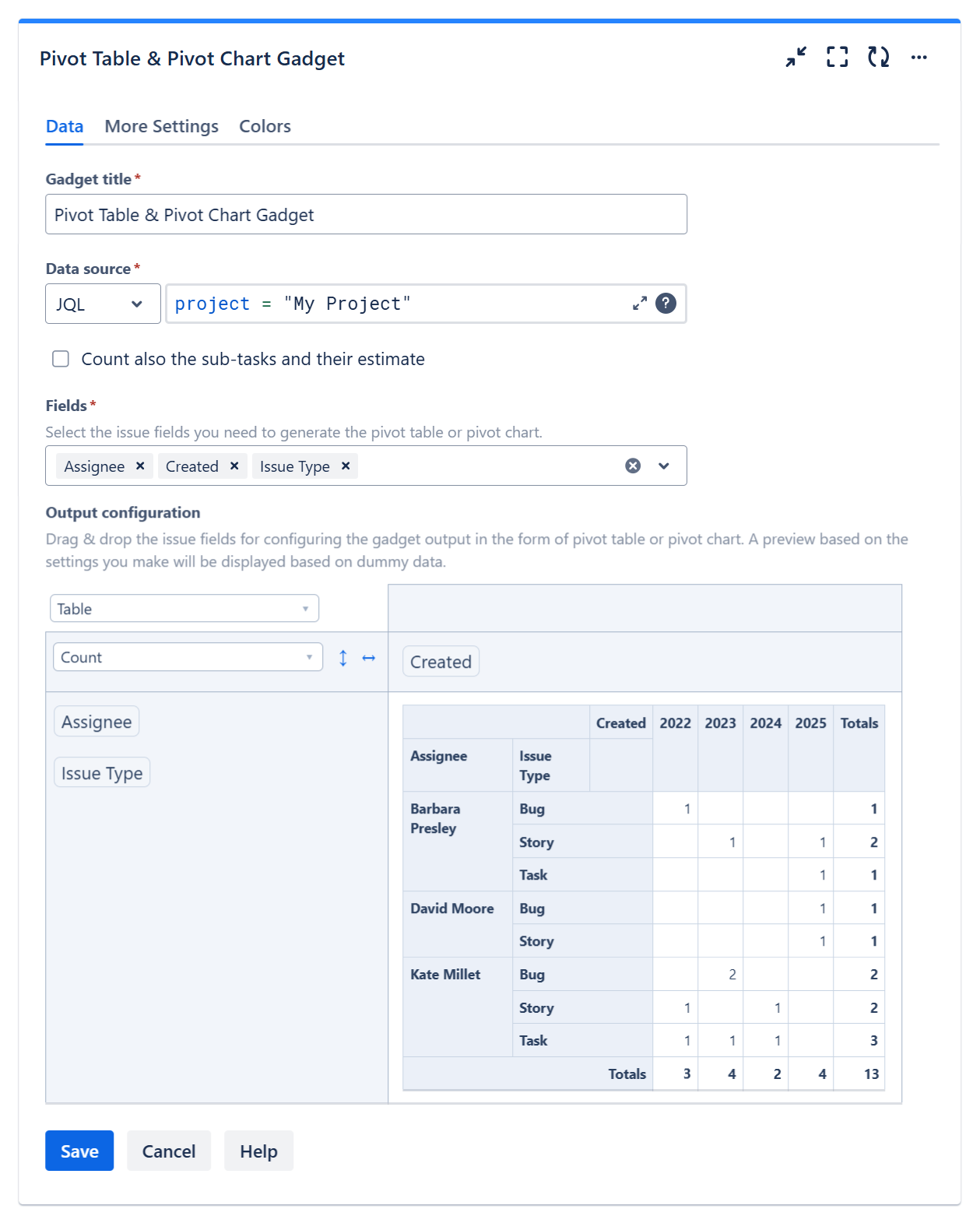
Overview
The Pivot Table and Pivot Chart gadget allows you to create and display pivot tables or pivot charts based on items in your projects using an intuitive drag-and-drop interface, similar to tools like Excel.
A pivot table is a data-summarization tool that helps you organize, group, and analyze data in a clear and manageable way. It transforms large datasets into concise, actionable reports by performing operations such as summing, averaging, or counting values based on selected fields.
With this gadget, you can build multi-dimensional tables directly on your dashboards, making complex project data easier to understand and analyze. It can calculate not only the count of work items, but also sum of numerical fields and percentages.
A pivot chart is a visual representation of the data in a pivot table. It helps you quickly identify patterns, trends, and comparisons by presenting summarized data graphically.
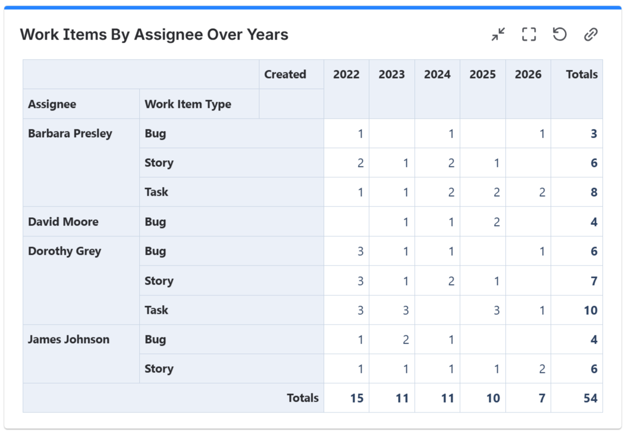
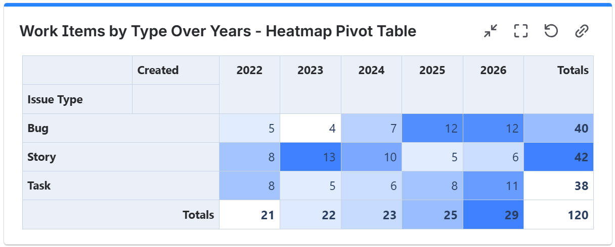
The gadget supports the configuration of multi-dimensional pivot tables, including simple tables and heat maps, as shown in the examples below.
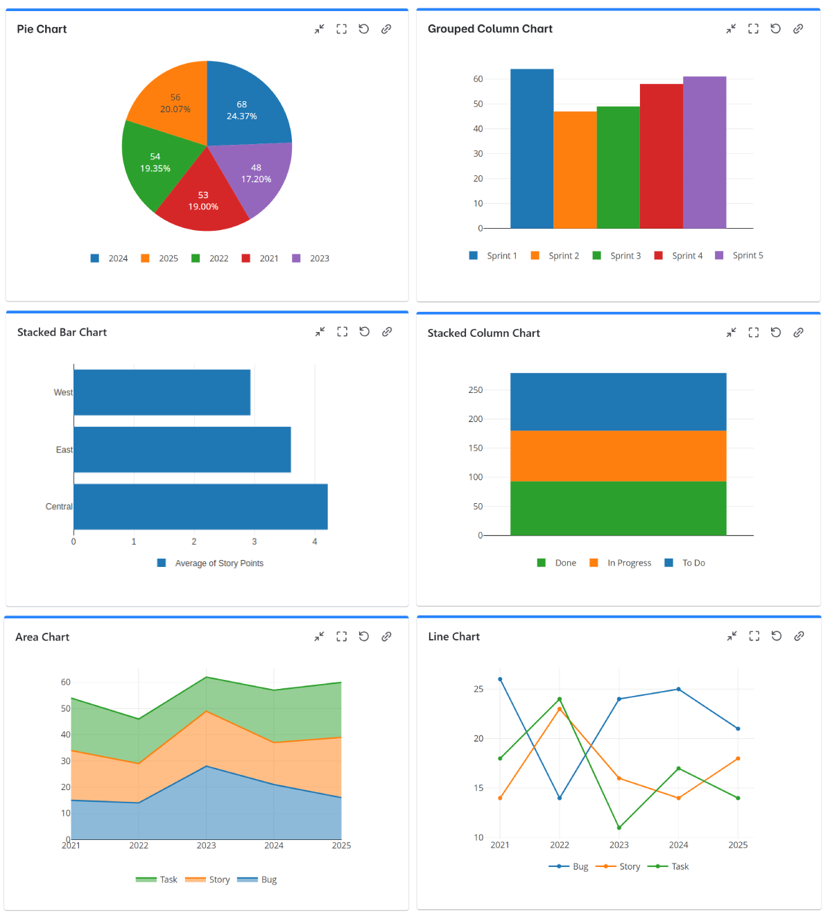
The gadget allows you to choose from various types of pivot charts: column charts, line charts, bar charts, stack area charts or pie charts.
Configuration
The settings of this gadget are divided in multiple tabs:
-
Data tab - contains the required settings of the gadget, such as title or data source
-
More Settings tab - contains the optional settings
-
Colors tab - lets you choose the base color of the heatmap table
Follow the steps below to configure the gadget as Pivot Table or Pivot Chart:
-
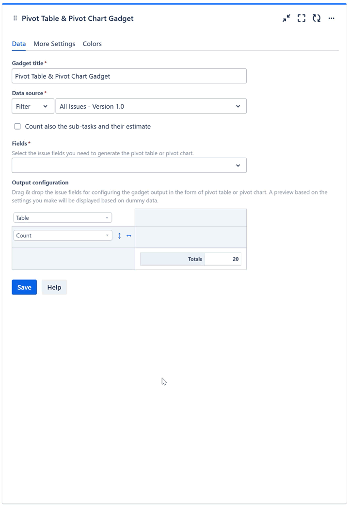
Add the Pivot Table & Pivot Chart gadget to your Jira dashboard.
-
Enter a suggestive Gadget title.
-
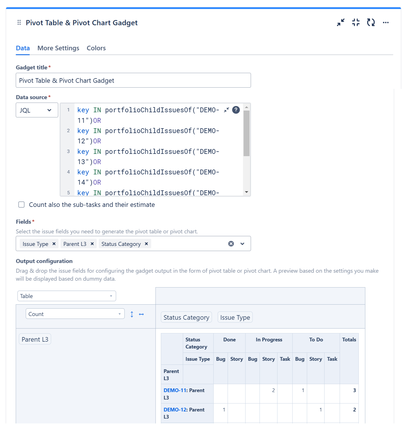
At Data Source, select the Filter or enter the JQL that returns the work items that serve as input data for the pivot table or pivot chart. If you want the sub-tasks from the selected filter or JQL to be included, check Count also the sub-tasks and their estimate.
-
At Fields, select the work item fields that you need in your pivot table or pivot chart.
-
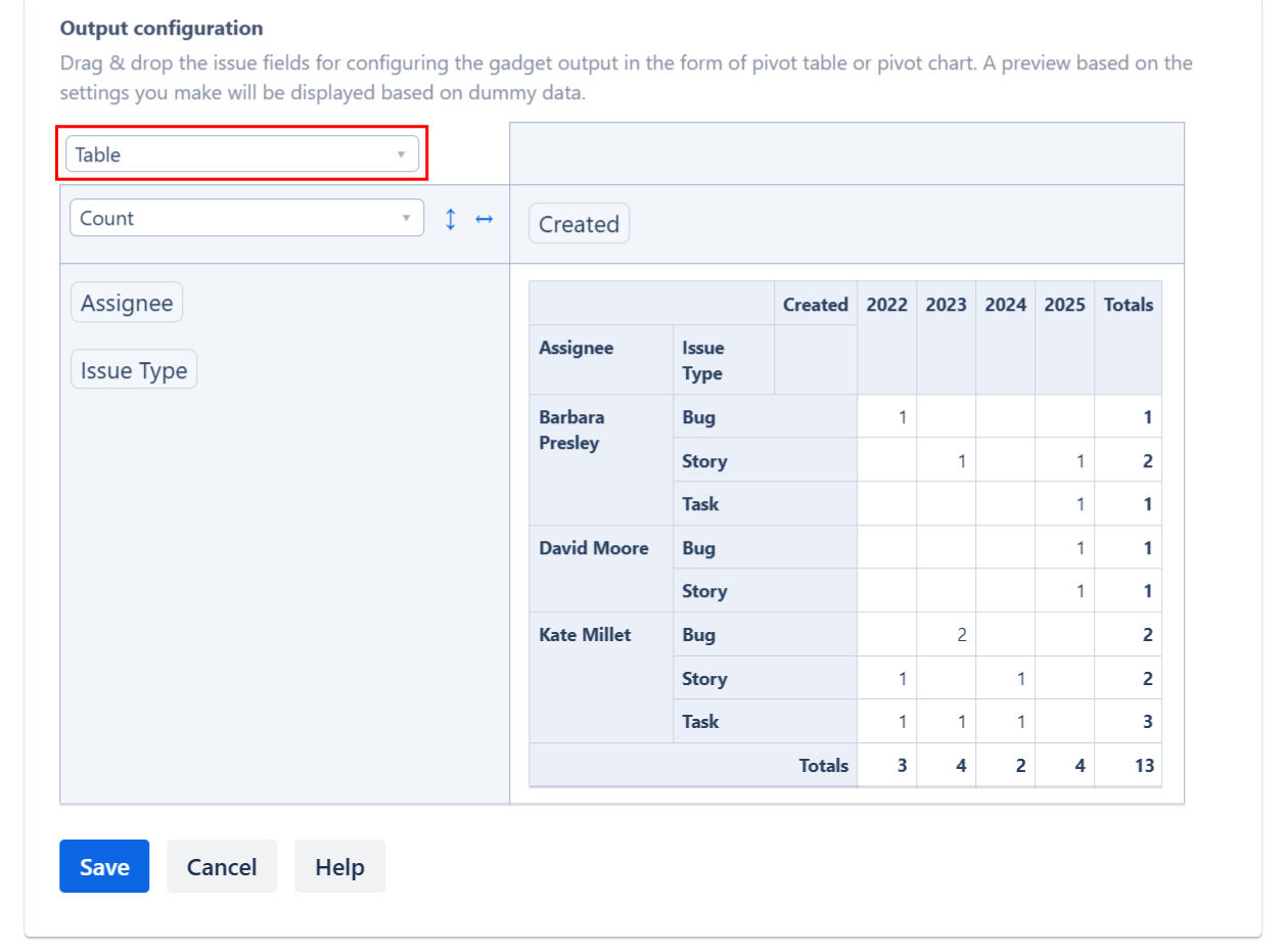
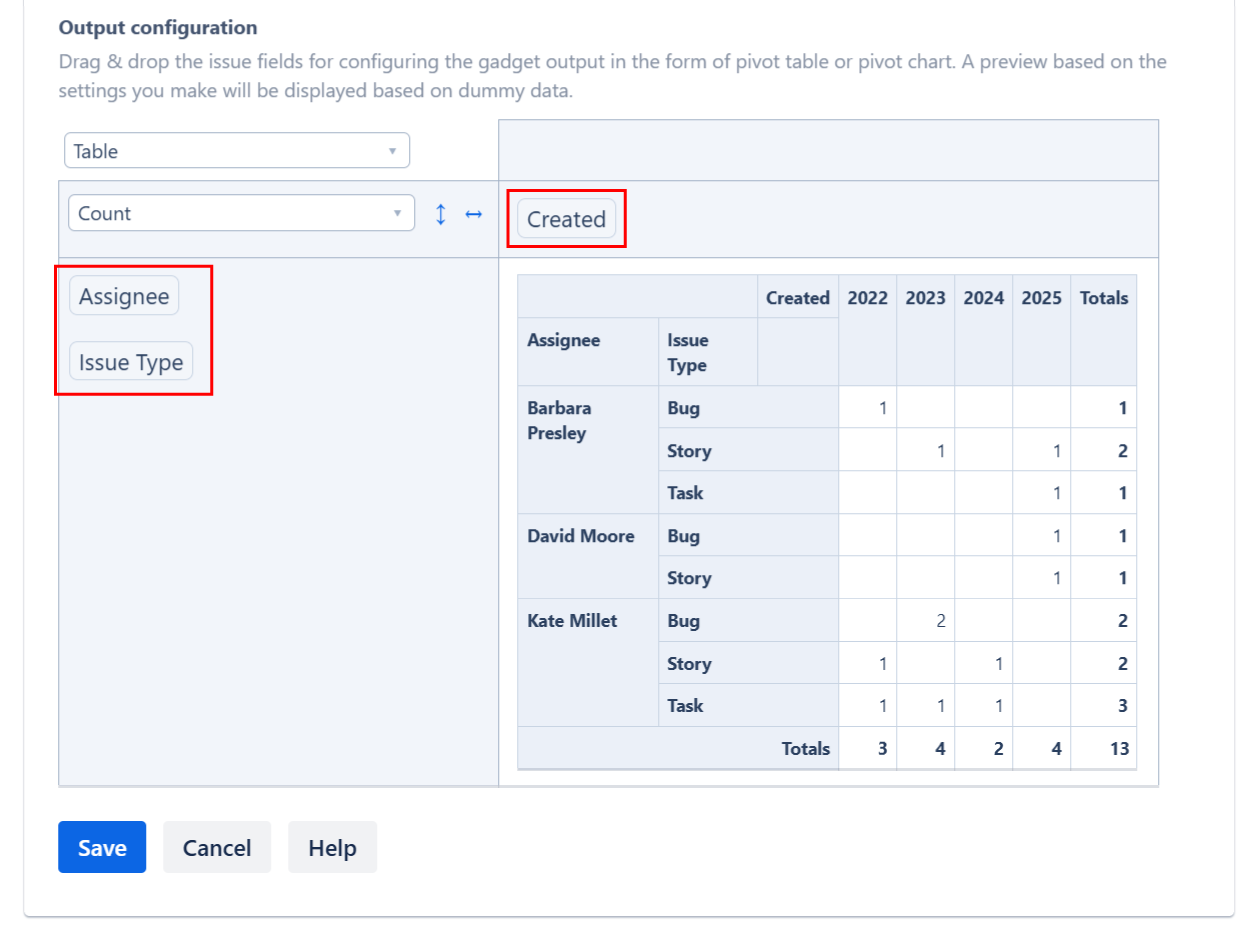
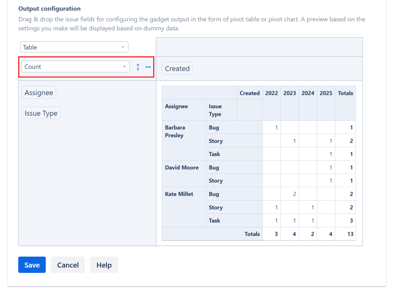
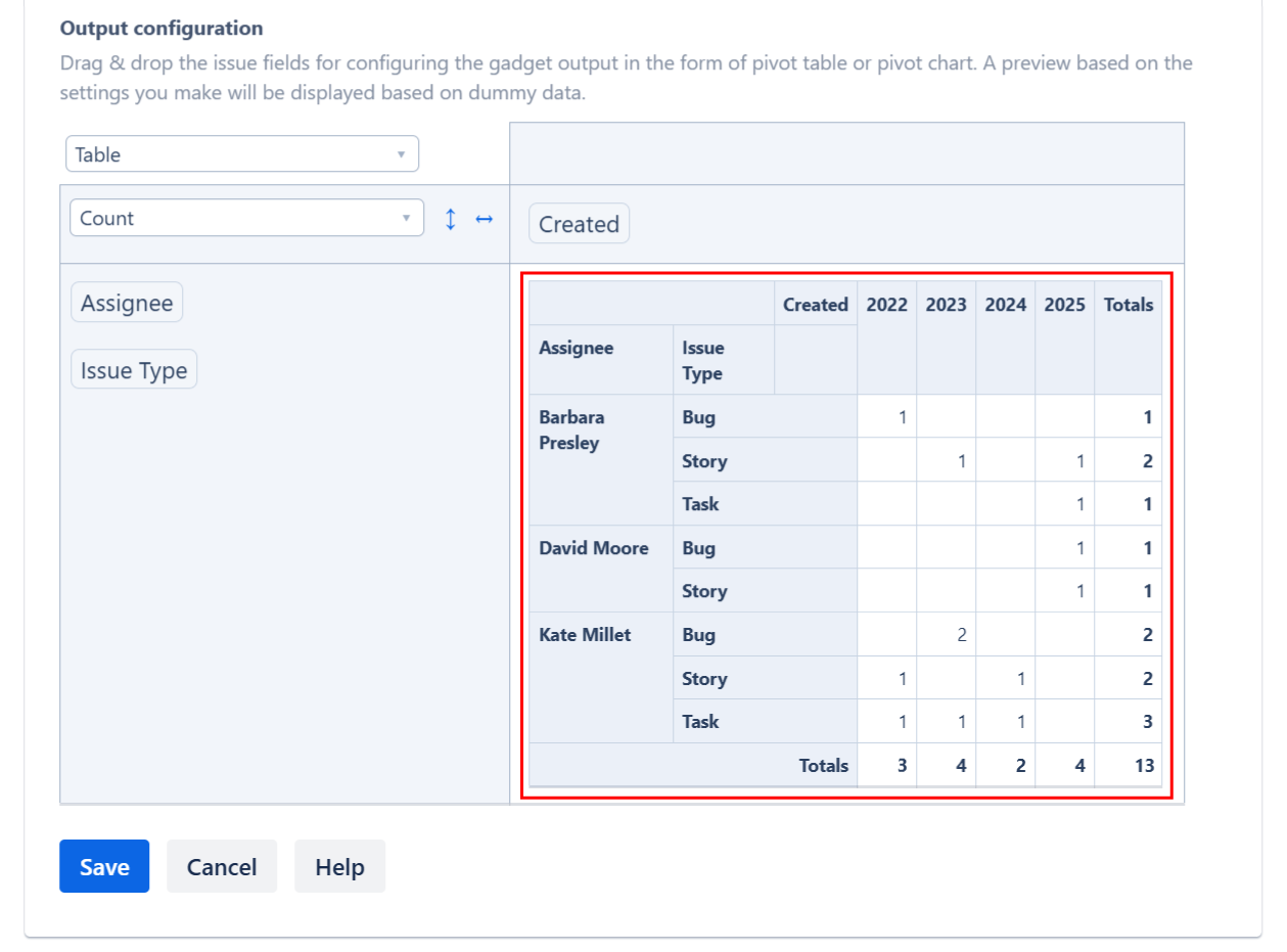
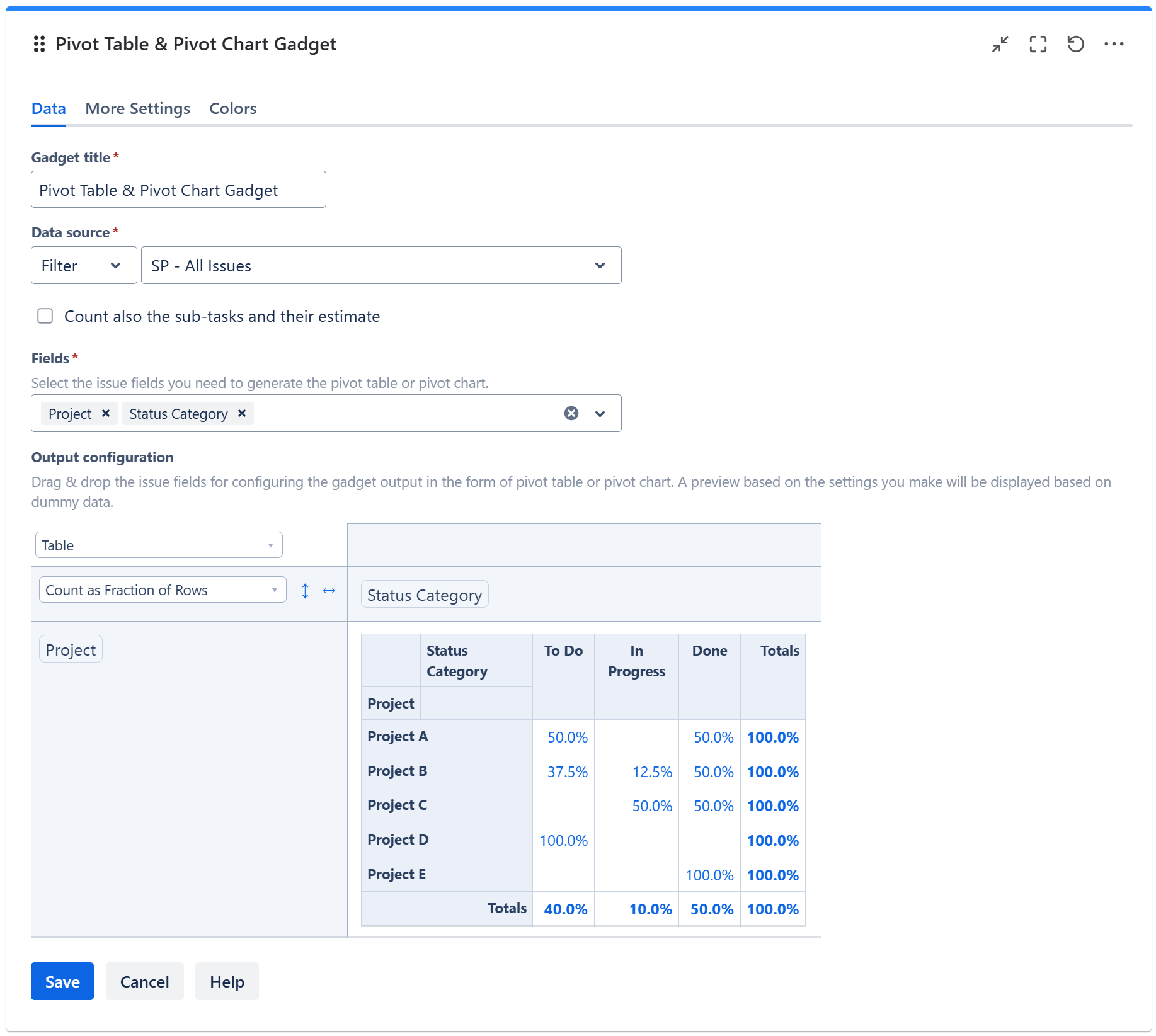
The table from the Output configuration section allows you to configure the pivot table or pivot chart.
-
In the top-right cell, select the type of the output data: pivot table or pivot chart.
-
If you want to display the results as a regular pivot table, select Table. Or, select Table Heatmap to display the results as a heatmap-capable table where the values of interest are highlighted in shades of red.
-
If you want to display as a pivot chart, select the appropriate option for the type of chart you want.
-
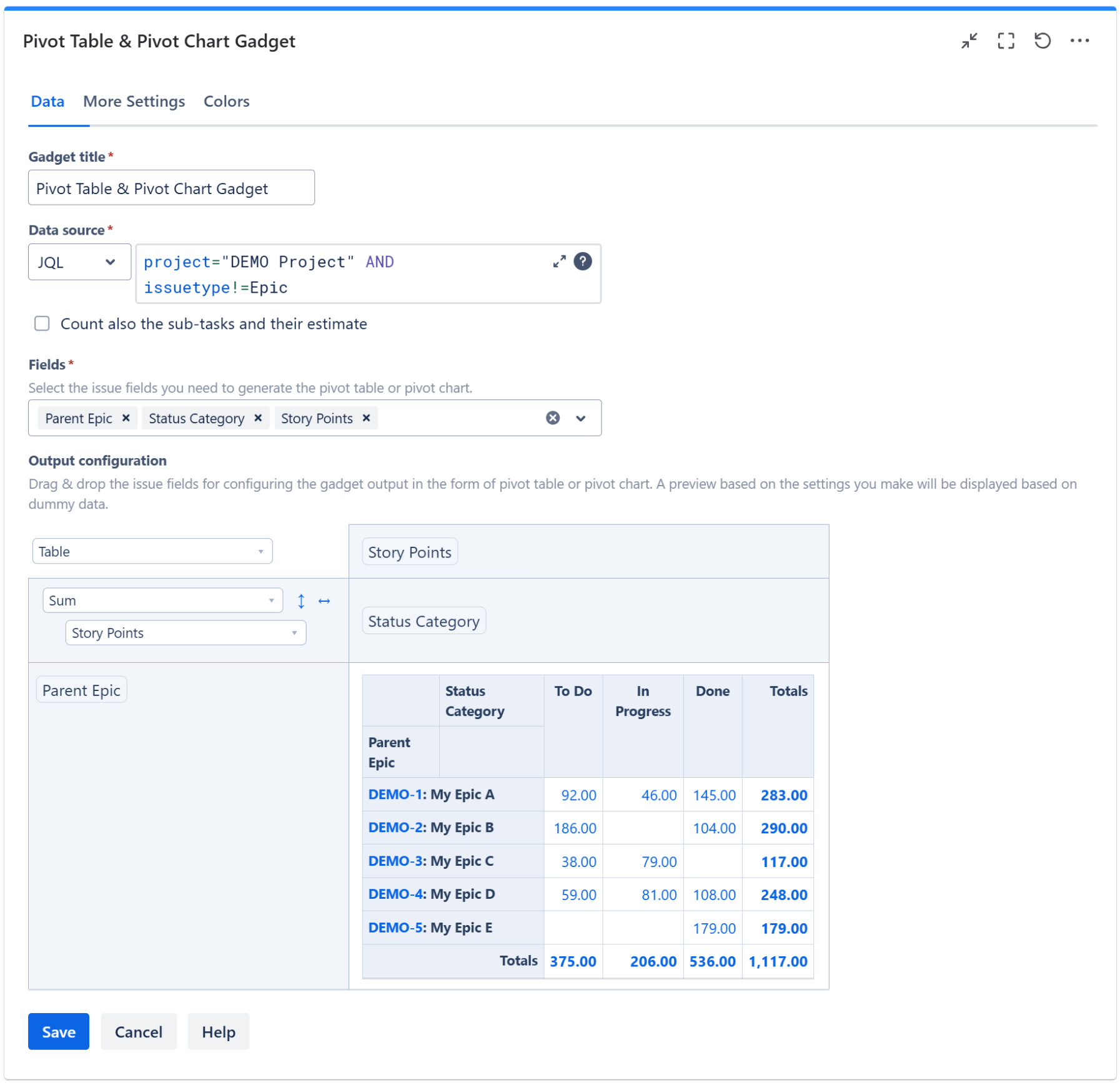
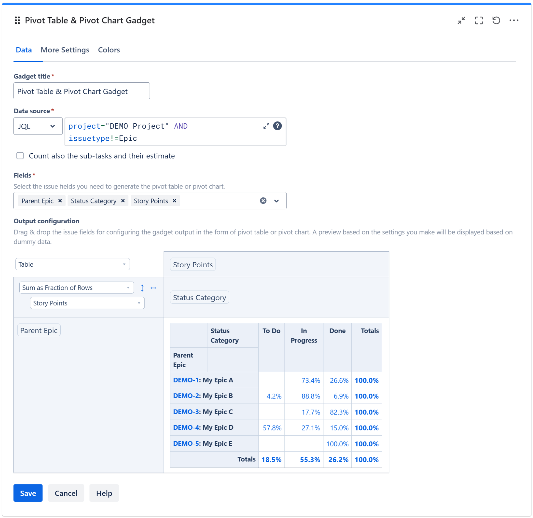
By using drag & drop, place the work item fields that you want to be displayed on the columns and the rows of the table.
-
Choose the calculation criteria. You can choose between various options. For example, to display the number of work items in table, select Count.
-
If you want to display the sum of an work item field (like Story Points), select Sum and then the select field; make sure the field that you want to sum-up was added to the Fields option above.
-
A preview of the gadget results is displayed based on the configuration you made and using some randomly generated dummy data.
-
On the More Settings tab, you can choose the display format for the fields that you selected for being used in the Pivot Table or Pivot Chart.
For example, for date fields like Created or Updated you can choose a format like “MM/dd/yyyy” or “yyyy”, while for time fields like Time Spent or Original Estimate you may choose to display the result in “Hours” or “Calendar Days (24h)”.
-
Make any adjustments as necessary and when you are done, click Save. The gadget will now display the pivot table or pivot chart that you configured by using real Jira data.
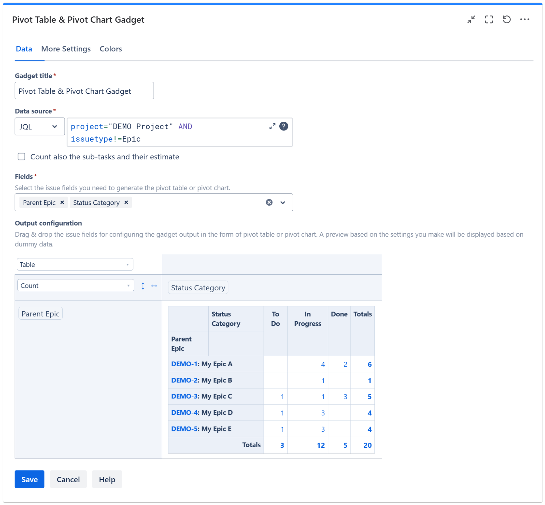
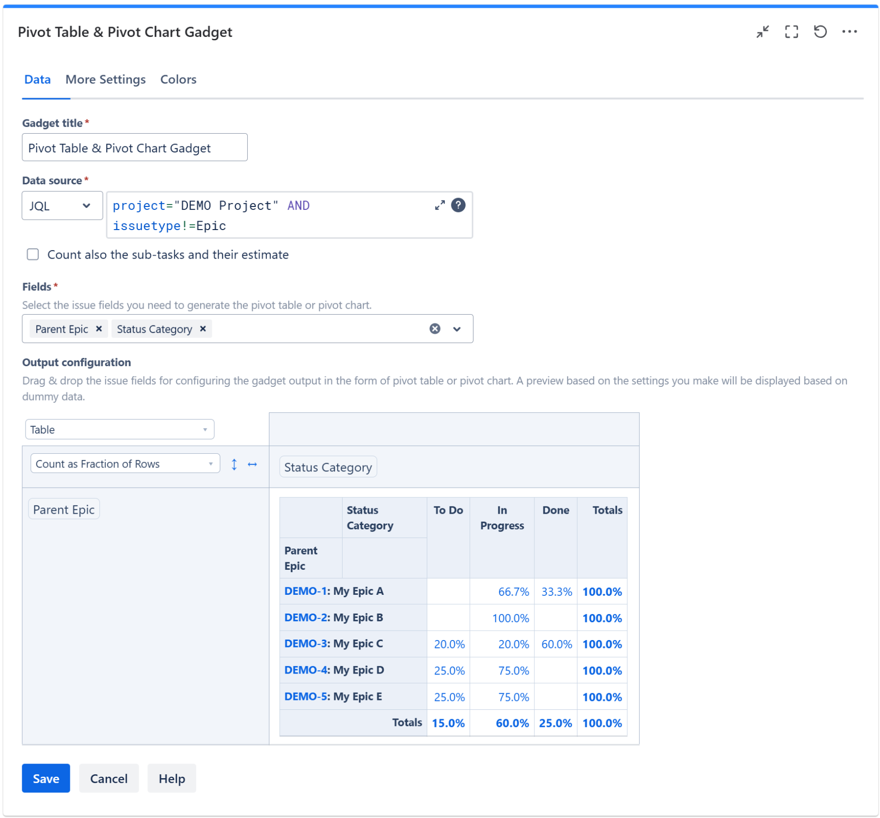
Data tab
On this tab you can configure the required settings of the gadget.
|
Setting |
Description |
|---|---|
|
Data Source |
Select the type of Data Source used by the gadget:
|
|
Include the sub-tasks |
Check this option if you want the sub-tasks from the selected filter or JQL to be included in the calculation. |
|
Fields |
Select the work item fields you need to generate the pivot table or pivot chart. The multi-value fields such as Labels, Fix Version/s or Components are marked with the symbol If the Sprint field is selected, only the most recent sprint is considered for work items that have gone through multiple sprints. The Parent Epic (on Cloud only) and Epic Link fields can be used to display the parent epics. The epics are displayed in form of key: summary (for example, DEMO-1: My epic summary). See more examples in section Epics Progress. Also, on Cloud you can display statistics at the initiative or theme level if you have these additional hierarchy levels added on top of epics. For this, use Parent of Epic (for work items with hierarchy level 2 work items) or Parent L3 (for work items with hierarchy level 3). See more examples in section Progress of the Initiatives or Themes. You can also select field specific to Jira Service Management projects such as Satisfaction or Sentiment. If you enabled approvals in your Jira Service Management instance, you can generate statistics based on these fields:
|
|
Output configuration |
This is the place where you can configure the pivot table or pivot chart. 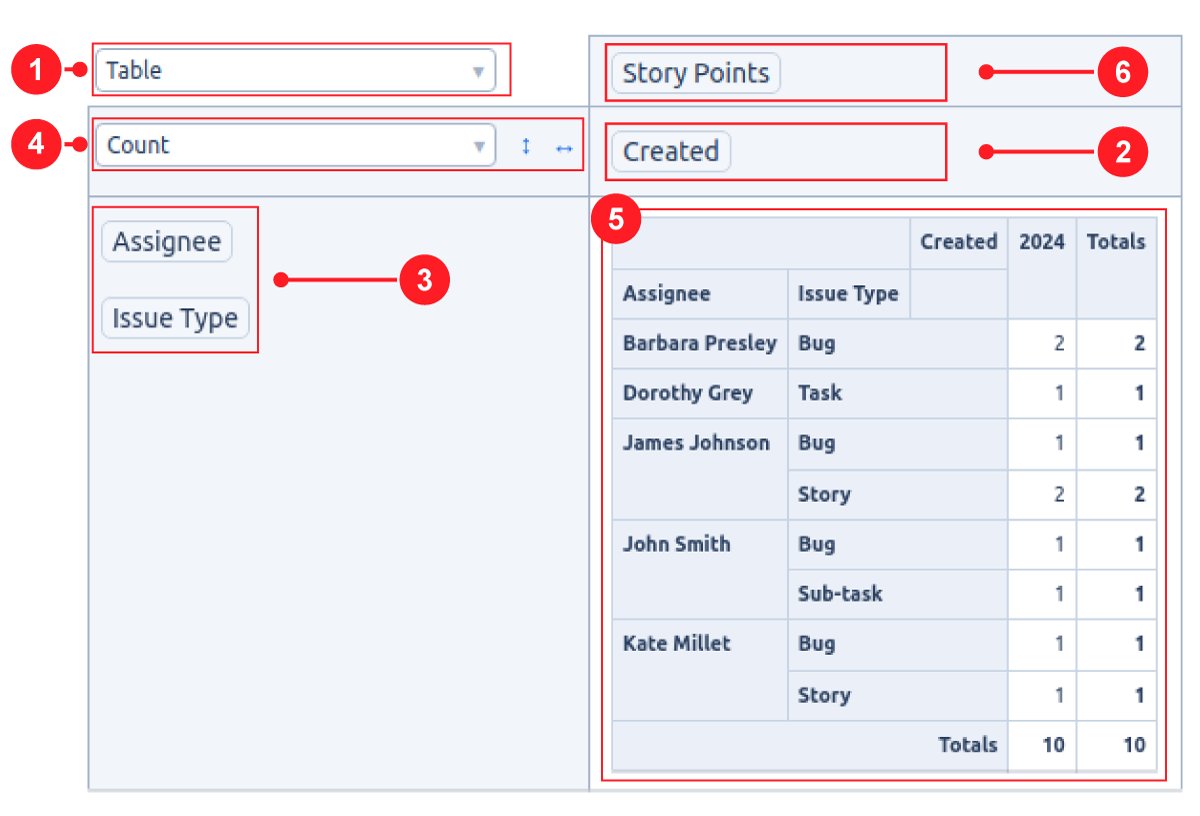
Note If you drag & drop a field between the columns area
|

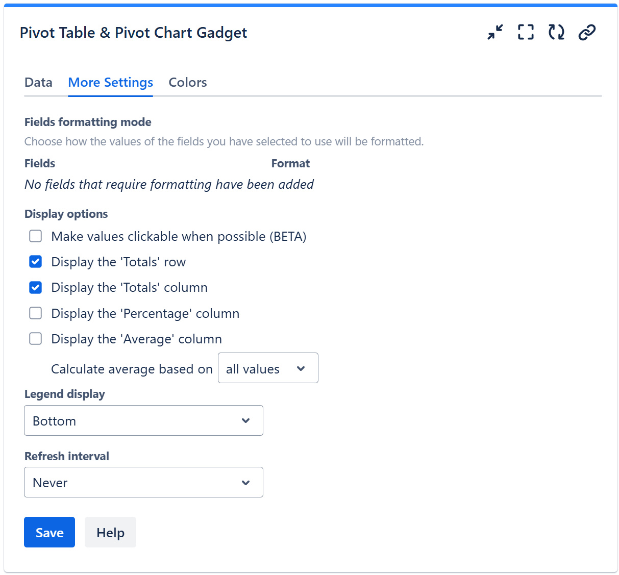
More Settings tab
On this tab you can configure the optional settings of the gadget.
|
Setting |
Description |
|---|---|
|
Fields formatting mode |
For the fields that you selected on the Data tab for being used in the Pivot Table or Pivot Chart you may specify the format to be used for displaying their values. For example, for date fields like Created or Updated you can choose a format like “MM/dd/yyyy” or “yyyy”, while for time fields like Time Spent or Original Estimate you may choose to display the result in “Hours” or “Calendar Days (24h)”. To display quarters of the year, choose a format that contains “Q“, such as “Q yyyy“ or “yy-Q“. To display weeks of the year, choose “Week dd MMM yy“ or “Week of MMM dd, yyyy“. Also, you can choose a format that contains “ww“, such as “ww yyyy“ or “yy-ww“. |
|
Make values clickable when possible |
Check this option if you want the gadget to display the calculated values as clickable links. Clicking a value will open a Jira filter that returns the work items contributing to that value. This option applies only when the gadget is configured as a Table, Table Heatmap, Table Col Heatmap or Table Row Heatmap with a maximum of one field per row and/or per column. If multiple fields are used in either area, the clickable functionality will be disabled. In some cases, the values may still not be clickable even if you check this option and only one field is used per row and/or per column. This can happen when:
|
|
Display the 'Totals' row |
Check this option if you want the pivot table to display the 'Totals' row. It takes effect only if the widget is configured as Table, Table Heatmap, Table Col Heatmap or Table Row Heatmap. |
|
Display the 'Totals' column |
Check this option if you want the pivot table to display the 'Totals' column. It takes effect only if the widget is configured as Table, Table Heatmap, Table Col Heatmap or Table Row Heatmap. |
|
Display the 'Percentage' column |
Check this option if you want the pivot table to display the 'Percentage' column. It takes effect only if the widget is configured as Table, Table Heatmap, Table Col Heatmap or Table Row Heatmap. The percentage value on a row is calculated based on the value of the Total cell from the same row as a fraction of the Grand Total value. |
|
Display the 'Average' column |
Check this option if you want the pivot table to display the 'Average' column. It takes effect only if the gadget is configured as Table, Table Heatmap, Table Col Heatmap or Table Row Heatmap. You can choose to Calculate the average based on:
|
|
Legend display |
This setting only applies to pivot charts. Indicates whether the chart legend should be displayed or not and where exactly. |
|
Refresh interval |
Choose how often the gadget will refresh automatically. |
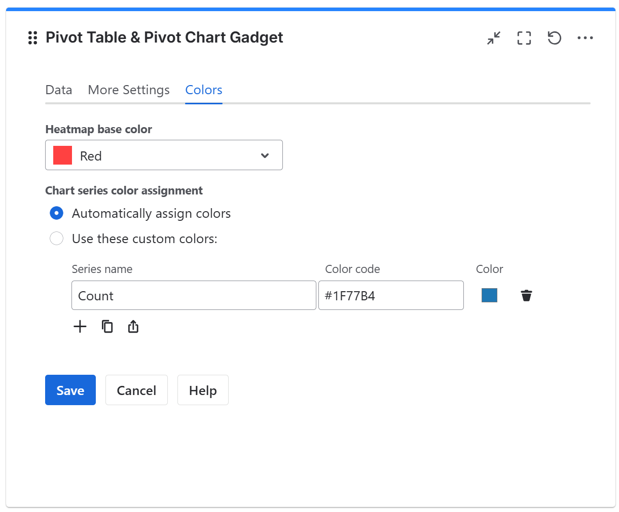
Colors tab
On this tab you can choose the base color for the heatmap table or for the chart series.
|
Setting |
Description |
|---|---|
|
Heatmap base color |
This option lets you adjust the hue (color tone) used to generate the heatmap color palette. It applies only when the widget output is set to Table Heatmap, Table Column Heatmap, or Table Row Heatmap. The widget also automatically adjusts the text color based on the background color to ensure optimal readability. |
|
Chart series color assignment |
This option lets you select how the colors will be applied to the series of the pivot charts.
Use the Add (+) button to add entries to the table, then enter the series name as they appear in the chart legend and select a color. You can also use the Copy and Import buttons to copy and import the color configuration to gadgets of the same type. |
More Examples
Here are more examples of using this gadget.
Epics Progress
There are various ways for displaying the progress of your epics.
Epics by No. of Tasks in each Status Category
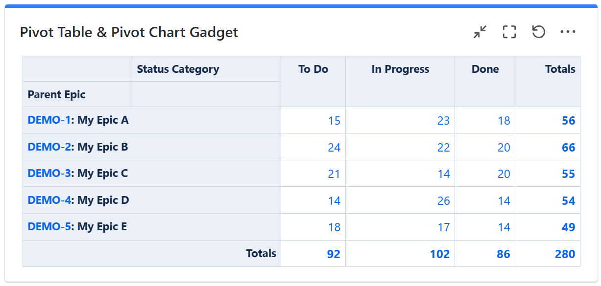
To achieve this, configure the gadget with a filter or JQL that returns work items (stories, tasks, bugs, etc) under the epic. Make sure the filter doesn't return the epics themselves. Then configure the gadget to calculate the Count as in the example below.
Epics Progress By Percentage of Tasks in each Status Category

To achieve this, configure the gadget with a filter or JQL that returns work items (stories, tasks, bugs, etc) under the epic. Make sure the filter doesn't return the epics themselves. Then configure the gadget to calculate the Count as Fraction of Rows as in the example below.
Epics by Sum of Story Points in each Status Category
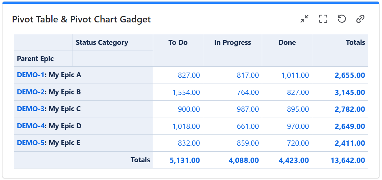
To achieve this, configure the gadget with a filter or JQL that returns work items (stories, tasks, bugs, etc) under the epic. Make sure the filter doesn't return the epics themselves. Then configure the gadget to calculate the Sum of Story Points as in the example below.
Epics by Percent of Story Points in each Status Category
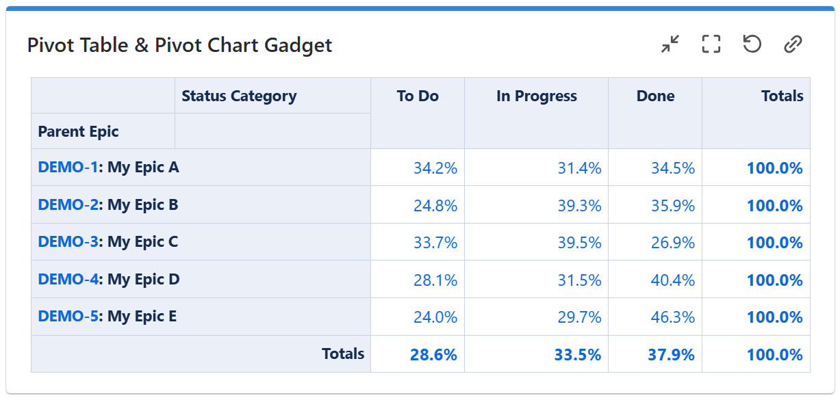
To achieve this, configure the gadget with a filter or JQL that returns work items (stories, tasks, bugs, etc) under the epic. Make sure the filter doesn't return the epics themselves. Then configure the gadget to calculate the Sum As Fraction of Rows for Story Points field as in the example below.
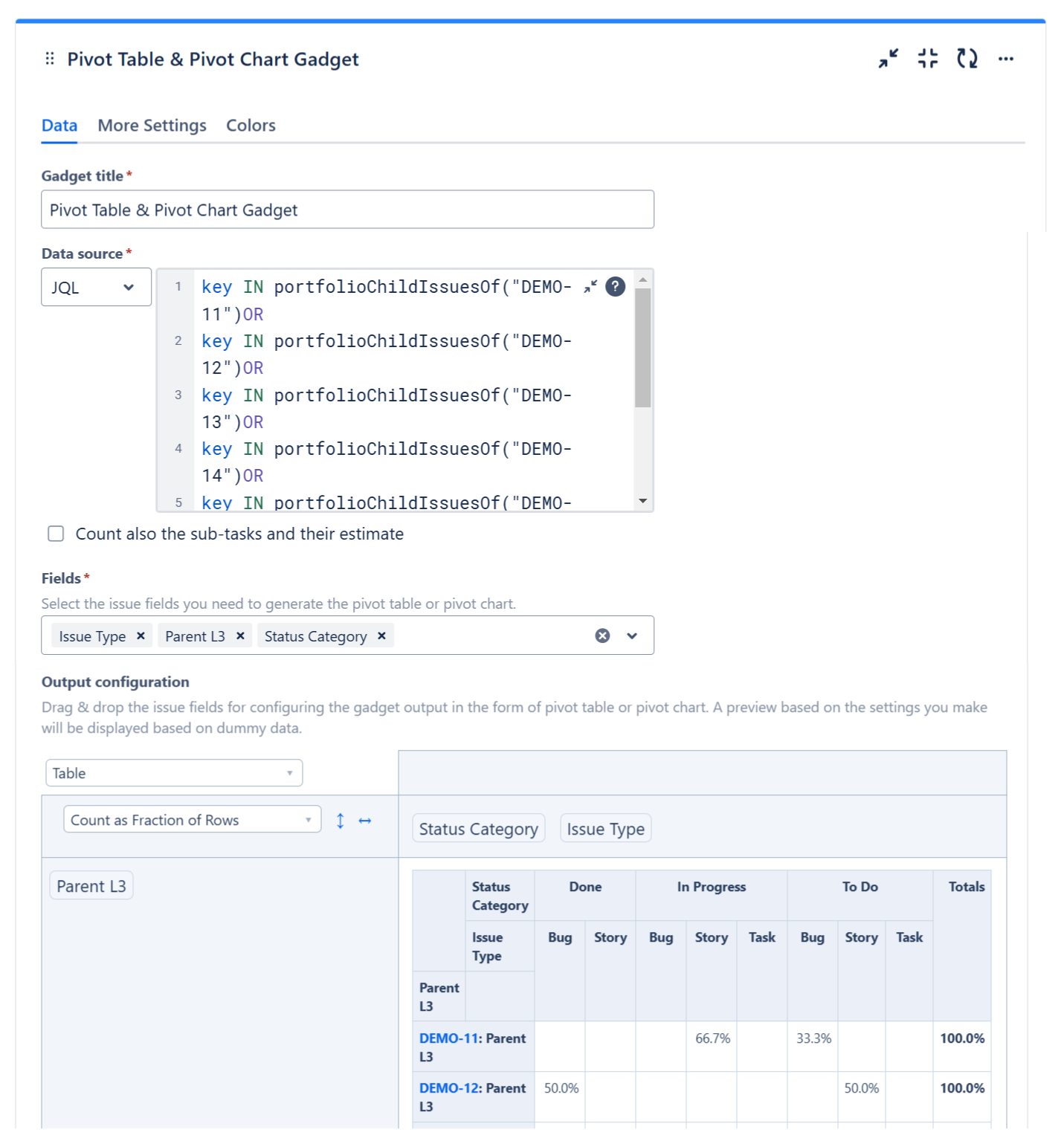
Progress of the Initiatives or Themes
If you have initiatives or themes defined in your Jira Cloud instance as work item types on top of epics, you can easily track their progress. This gadget support stats by two levels above the epic; all you have to do us to use one of these fields:
-
Parent of Epic - for Hierarchy Level 2 work items (one level above epic)
-
Parent L3 - for Hierarchy Level 3 work items (two levels above epic)
Initiatives or Themes by No. of Tasks in each Status Category split by work item type
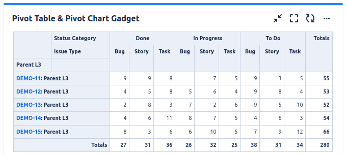
To achieve this, configure the gadget with a filter or JQL that returns the work items (stories, tasks, bugs, etc) under the initiative or theme. This is an example of JQL that returns all the work items from an initiative.
key IN portfolioChildIssuesOf("DEMO-11")
Make sure the filter doesn't return the initiatives or themes themselves. Then configure the gadget to calculate the Count as in the example below.
Progress of Initiatives or Themes By Percentage of Tasks in each Status Category
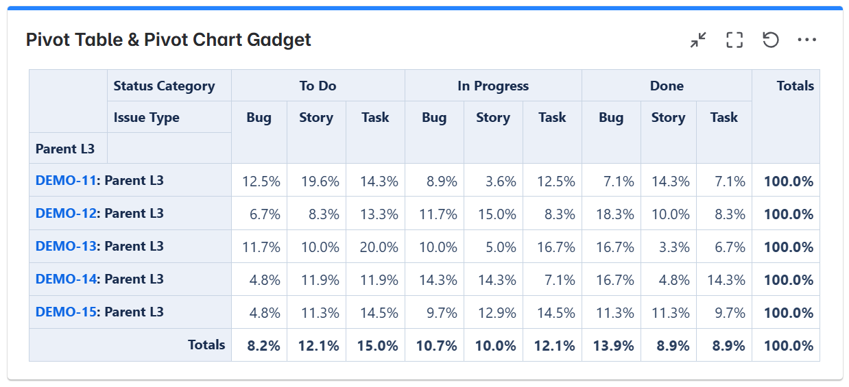
To achieve this, configure the gadget with a filter or JQL that returns the work items (stories, tasks, bugs, etc) under the initiative or theme. This is an example of JQL that returns all the work items from an initiative.
key IN portfolioChildIssuesOf("DEMO-11")
Make sure the filter doesn't return the initiatives or themes themselves. Then configure the gadget to calculate the Count as Fraction of Rows as in the example below.
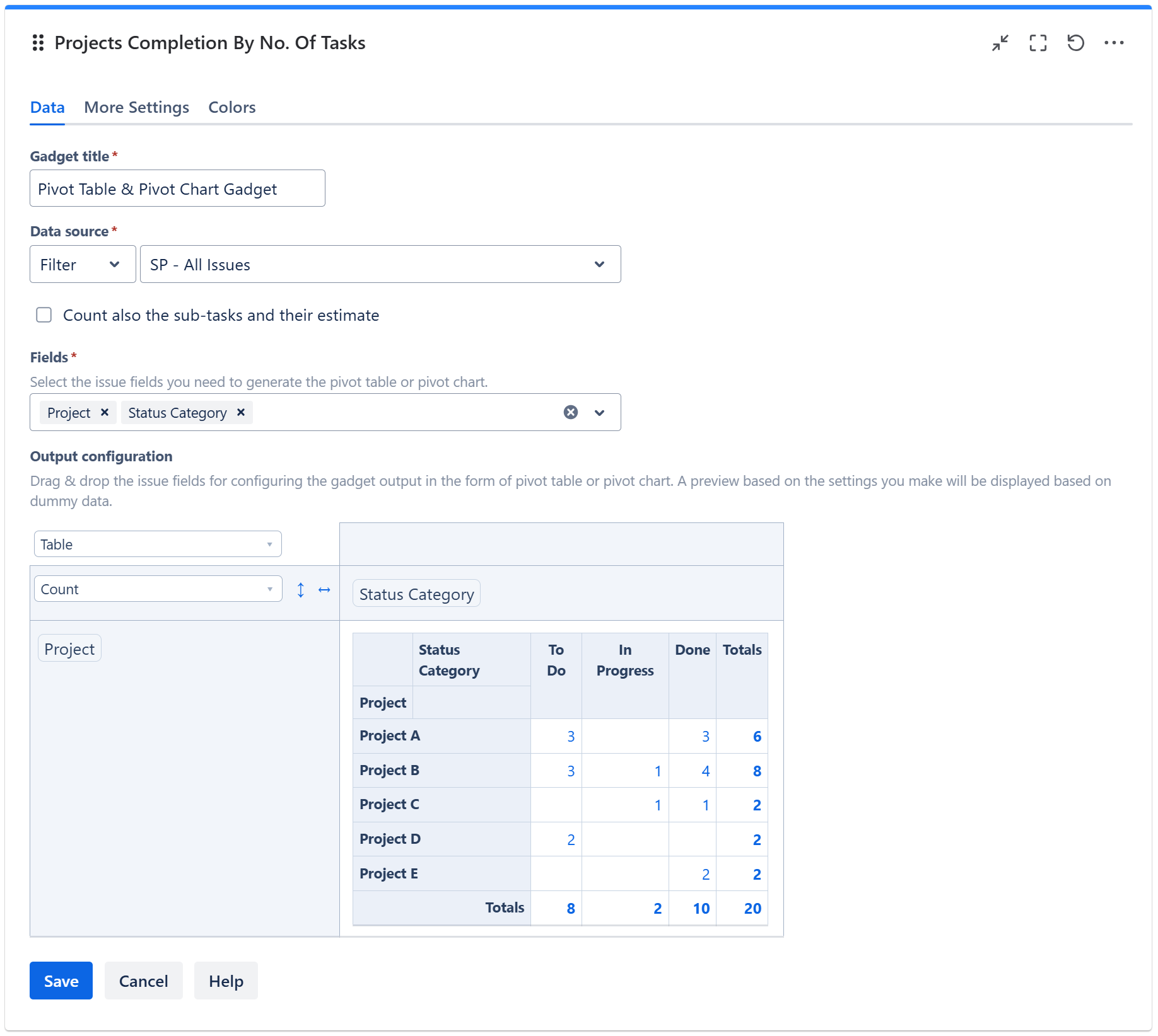
Projects Completion
There are various ways for displaying the progress your projects.
Projects by No. of Tasks in each Status Category
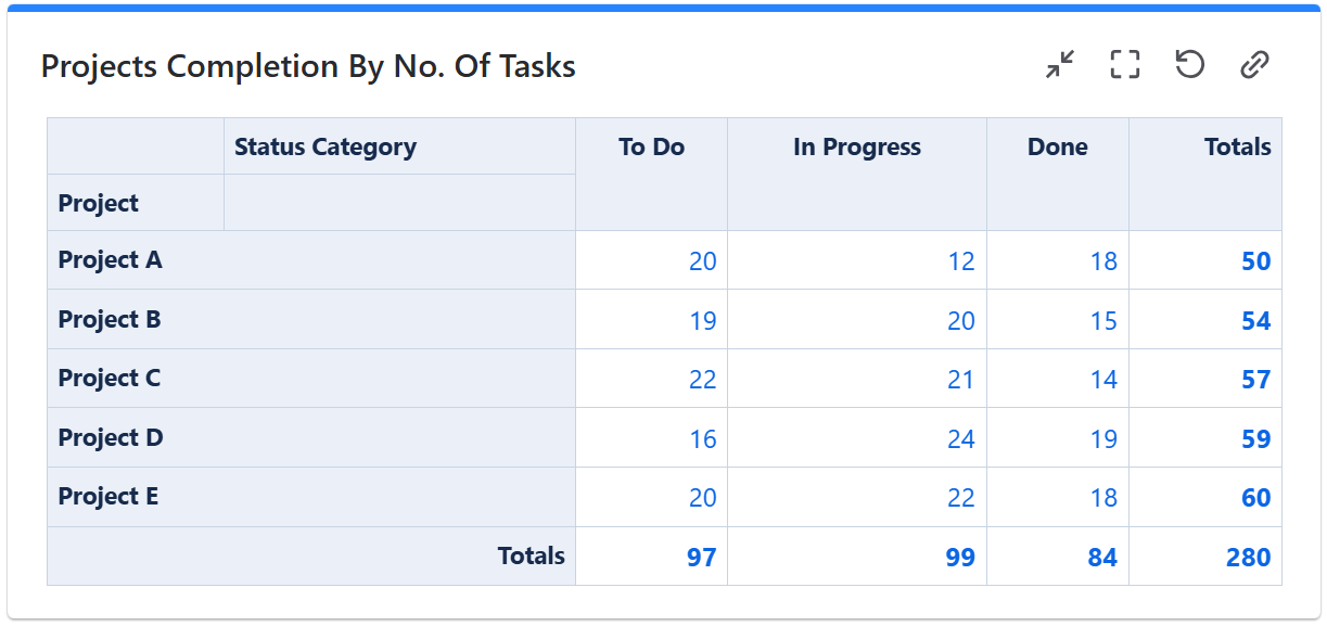
To achieve this, configure the gadget with a filter or JQL that returns work items (stories, tasks, bugs, etc) from the projects that you want to track. Then configure the gadget to calculate the Count as in the example below.
Projects by Percentage of Tasks in each Status Category
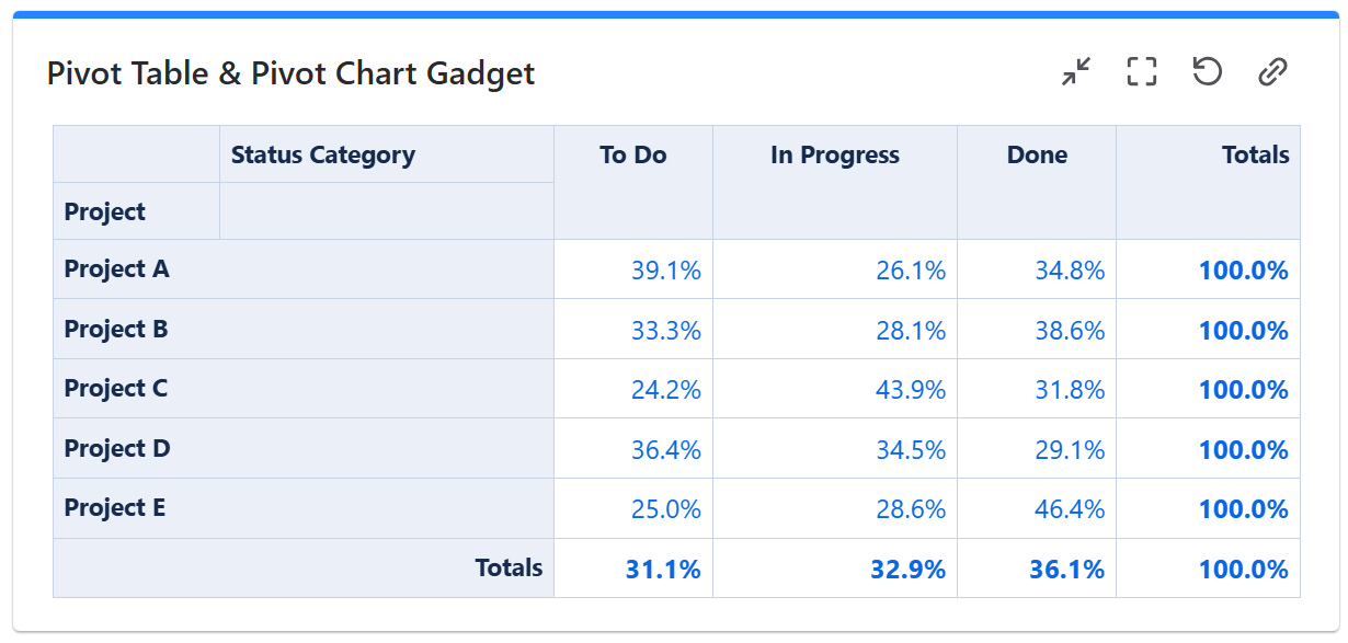
To achieve this, configure the gadget with a filter or JQL that returns work items (stories, tasks, bugs, etc) from the projects that you want to track. Then configure the gadget to calculate the Count as Fraction of Rows as in the example below.
Sprint Velocity by Team Member
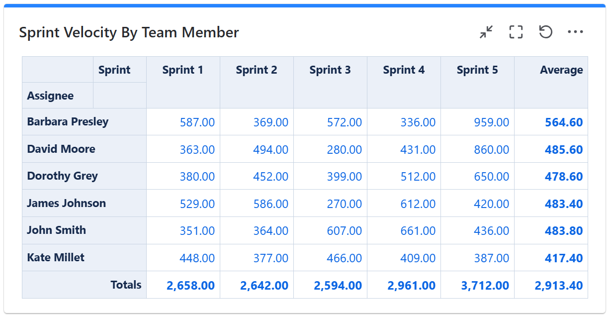
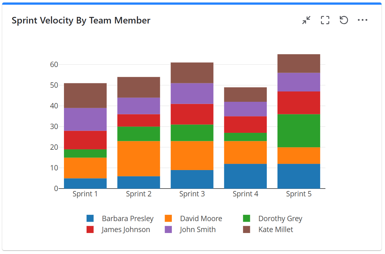
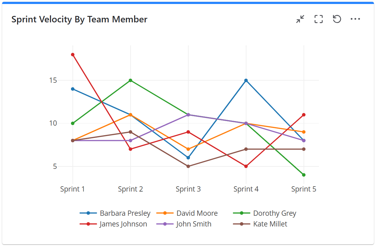
To achieve this, configure the gadget with a filter or JQL that returns work items (stories, tasks, bugs, etc) from the sprints that you want to track. Then configure the gadget to calculate the Sum of Story Points in the example below.
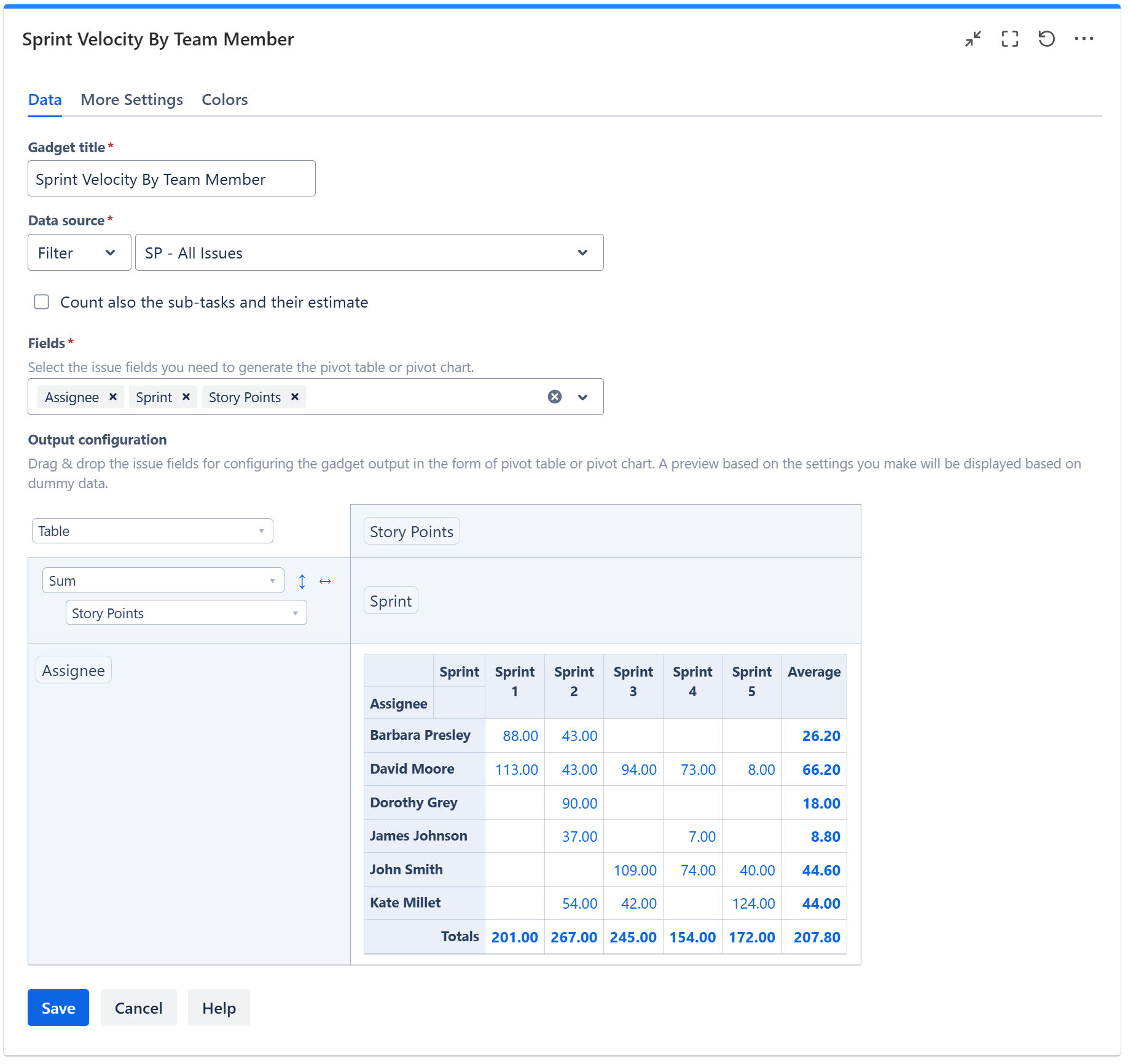
On the More Settings tab, choose to display the ‘Average’ column. If you want the gadget output in form of a chart, choose Stacked Column Chart or Line Chart instead of Table.
Related blog articles
The following blog articles provide more information on how to use this gadget.
-
An effective dashboard for Service Desk and Customer Support teams in Jira Service Management
-
How to measure customer satisfaction in Jira or Confluence with Great Gadgets app
-
Tracking Customer Sentiment in JSM with Great Gadgets for Jira
-
Approvals in Jira Service Management: How to Display Approval Data with Great Gadgets
-
7 Essential Team Performance Metrics To Track In Jira By Using Great Gadgets App