
This gadget is available only in the Advanced Edition of Great Gadgets.
Overview
The Worklog Reports & Timesheets gadget helps teams analyze and report on time logged in Jira. It provides flexible reporting options that allow you to visualize worklog data in pivot tables or charts, making it easier to understand how time is distributed across projects, team members, and work items.
Use this gadget to monitor individual or team effort, review logged hours, track workload distribution, and support internal reporting or billing processes. With default presets and filtering options, you can quickly generate detailed timesheets or high-level effort summaries tailored to your needs.
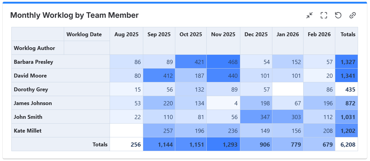
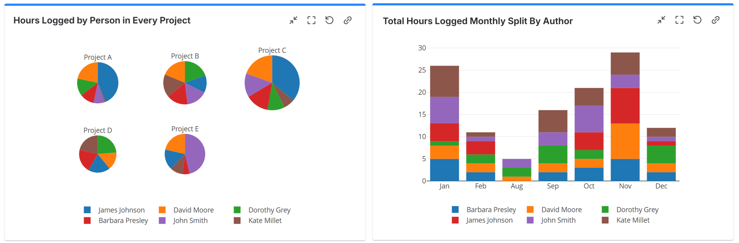
You can generate weekly or monthly summaries grouped not only by Worklog Author or Worklog Date, but also by work item fields such as Priority, Project or other available fields. The gadget supports multiple filtering options, allowing you to tailor reports for operational tracking, workload analysis, internal reporting, or billing purposes.
Configuration
The settings of this gadget are divided in multiple tabs:
-
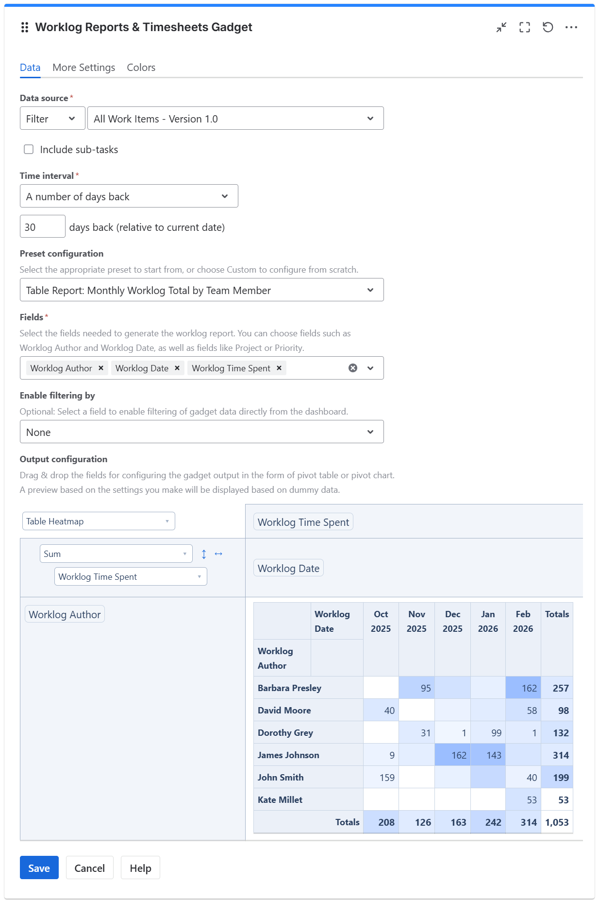
Data tab - contains the required settings of the gadget, such as title or data source
-
More Settings tab - contains the optional settings
-
Colors tab - lets you choose the base color of the heatmap table
Data tab
On this tab you can configure the required settings of the gadget.
|
Setting |
Description |
|---|---|
|
Data Source |
Select the type of Data Source used by the gadget — the work items that contain the worklogs you want to process.
|
|
Include sub-tasks |
Check this option if you want the sub-tasks from the selected filter or JQL to be included in the calculation. |
|
Time interval |
Represents the time interval during which the worklogs to be processed were added. You can choose from multiple options: Custom dates - choose this option if you want to manually enter a Start date and an End date. A number of days back - By choosing this option, the gadget will use a rolling time interval with a number of days back to the current day. From date - choose this option if you want the gadget to display worklogs recorded from a specific date onward. Current month - choose this option to display worklogs recorded during the current calendar month. |
|
Preset configuration |
Select one of the available presets as a starting point for the gadget configuration, or choose Custom to configure the gadget from scratch. Selecting a preset automatically changes the gadget settings in the Data and More Settings tabs. Presets available:
|
|
Fields |
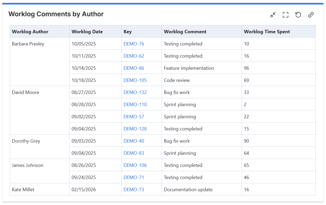
Select the work item fields you need to generate the table or chart. You can select worklog-specific fields such as Worklog Author, Worklog Date, Worklog Time Spent, and Worklog Comment, as well as work item fields such as Priority, Project, or Status. |
|
Enable filtering by |
Use this option to narrow down the worklogs displayed in the gadget. You can filter by various Jira fields, such as project, issue type, assignee, or custom fields, to focus on specific worklog entries. |
|
Output configuration |
This is the place where you can configure the pivot table or pivot chart. 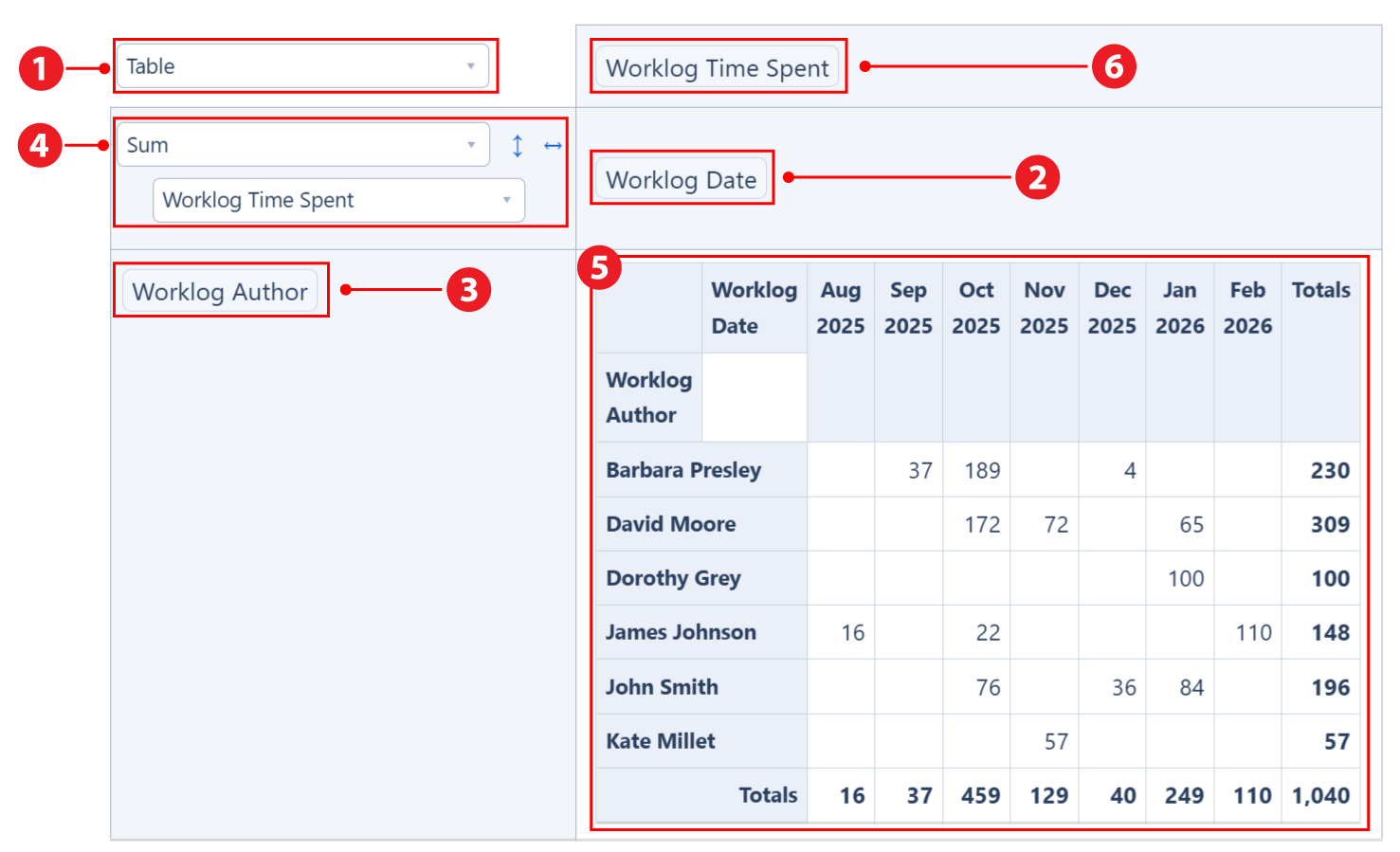
Note If you drag & drop a field between the columns area |
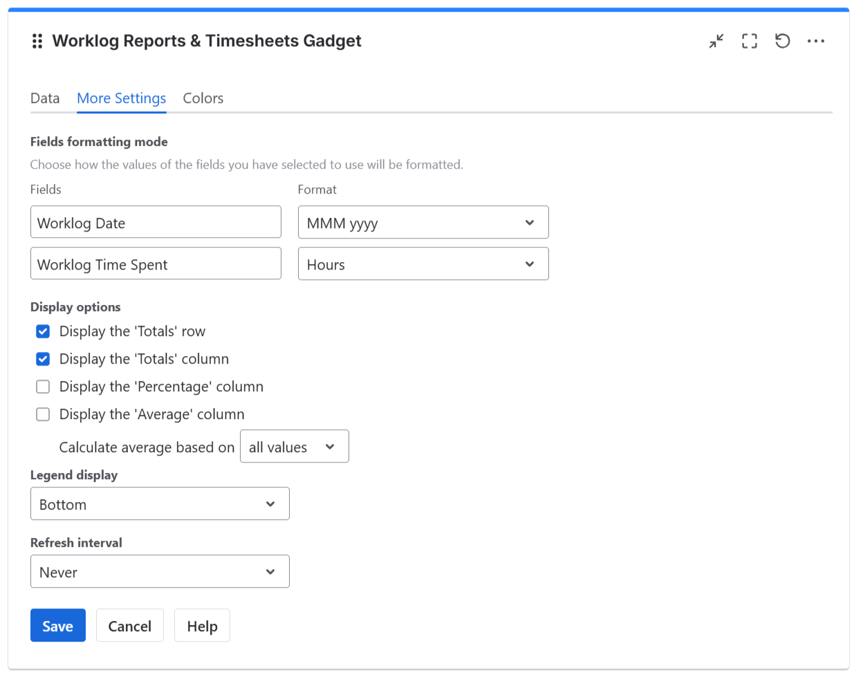
More Settings tab
On this tab you can configure the optional settings of the gadget.
|
Setting |
Description |
|---|---|
|
Fields formatting mode |
For the fields that you selected on the Data tab for being used, you may specify the format to be used for displaying their values. For example, for date fields like Worklog Date you can choose a format like “MM/dd/yyyy” or “yyyy”, while for time fields like Worklog Time Spent you may choose to display the result in “Hours” or “Calendar Days (24h)”. To display quarters of the year, choose a format that contains “Q“, such as “Q yyyy“ or “yy-Q“. To display weeks of the year, choose “Week dd MMM yy“ or “Week of MMM dd, yyyy“. Also, you can choose a format that contains “ww“, such as “ww yyyy“ or “yy-ww“. |
|
Display the 'Totals' row |
Check this option if you want the pivot table to display the 'Totals' row. It takes effect only if the gadget is configured as Table, Table Heatmap, Table Col Heatmap or Table Row Heatmap. |
|
Display the 'Totals' column |
Check this option if you want the pivot table to display the 'Totals' column. It takes effect only if the gadget is configured as Table, Table Heatmap, Table Col Heatmap or Table Row Heatmap. |
|
Display the 'Percentage' column |
Check this option if you want the pivot table to display the 'Percentage' column. It takes effect only if the gadget is configured as Table, Table Heatmap, Table Col Heatmap or Table Row Heatmap. The percentage value on a row is calculated based on the value of the Total cell from the same row as a fraction of the Grand Total value. |
|
Display the 'Average' column |
Check this option if you want the pivot table to display the 'Average' column. It takes effect only if the gadget is configured as Table, Table Heatmap, Table Col Heatmap or Table Row Heatmap. You can choose to Calculate the average based on:
|
|
Legend display |
This setting only applies to pivot charts. Indicates whether the chart legend should be displayed or not and where exactly. |
|
Refresh interval |
Choose how often the gadget will refresh automatically. |
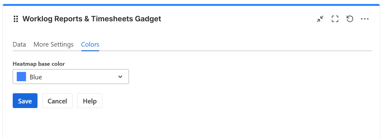
Colors tab
On this tab you can choose the base color for the heatmap table.
|
Setting |
Description |
|---|---|
|
Heatmap base color |
This option lets you adjust the hue (color tone) used to generate the heatmap color palette. It applies only when the widget output is set to Table Heatmap, Table Column Heatmap, or Table Row Heatmap. The widget also automatically adjusts the text color based on the background color to ensure optimal readability. |