
Overview
The Control Chart widget helps you monitor how quickly your team delivers work and identify items that took longer than expected.
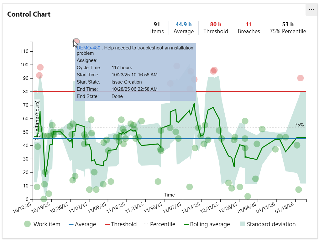
Based on your configuration, it calculates key Kanban metrics—such as Cycle Time, Lead Time, or the time between two workflow states—for work items returned by a specified shared query within a selected time interval. The results are displayed as a scatter plot, where each point represents an individual work item and its cycle time.
Optionally, the chart can display an average line, a custom threshold line to quickly highlight unusually long cycle times, and a rolling average line to help track delivery trends over time.
When you hover over a data point in the chart, a tooltip appears with detailed information about the item, such as its key, assignee and cycle time.
How does it work?
The data is calculated for a specified time interval or an interval relative to the current day. The widget identifies items from the selected query that had a completed cycle in the specified interval, determines the cycle(s) duration and displays them in the chart along with the date when their cycle ended.
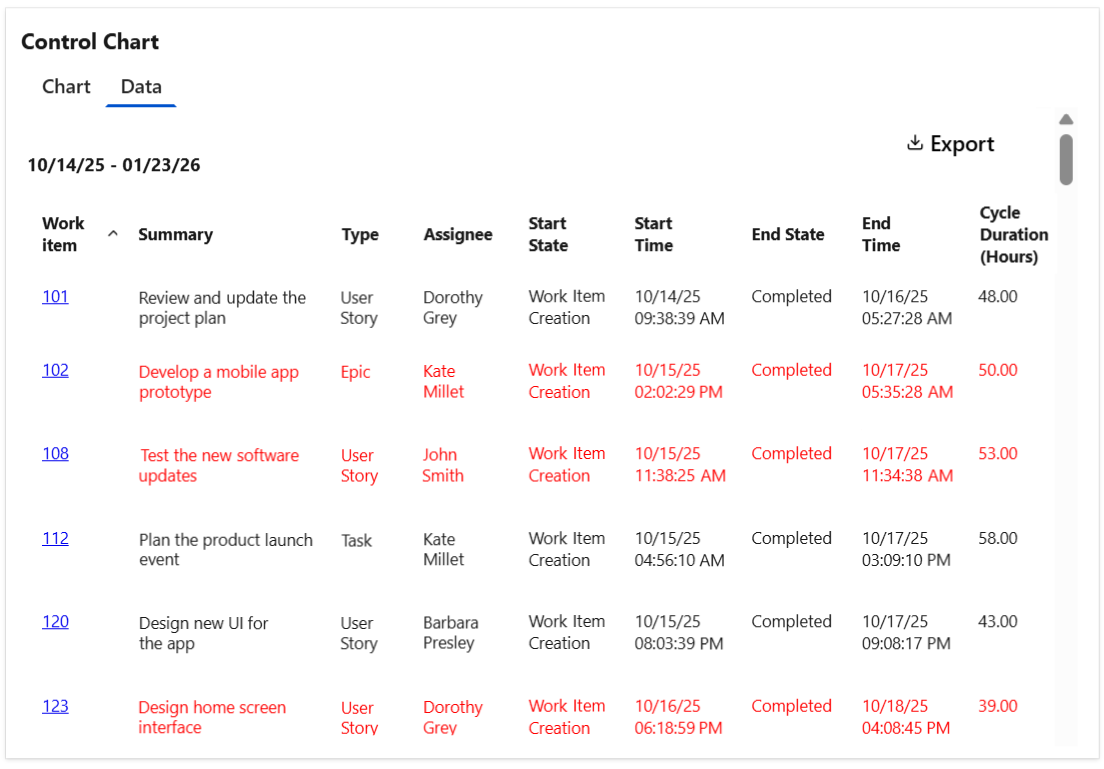
Optionally, the widget can display a Data tab with detailed information for each work item shown in the chart, including the cycle time details and the average calculation. The table can be easily exported as a CSV file.
Tips & Tricks
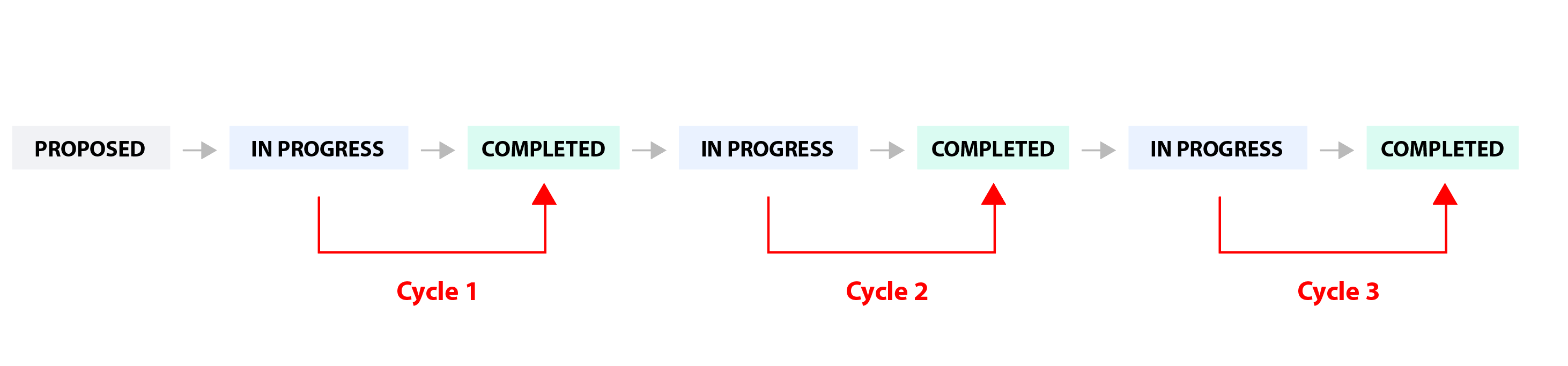
To calculate "Cycle Time", set the following:
-
Cycle starts = When the item entered a state that has category "In Progress"
-
Cycle ends = When the item entered a state that has category "Completed"
To calculate "Lead Time", set the following:
-
Cycle starts = When the item was created or when the item entered a state that has category "Proposed"
-
Cycle ends = When the item entered a state that has category "Completed"
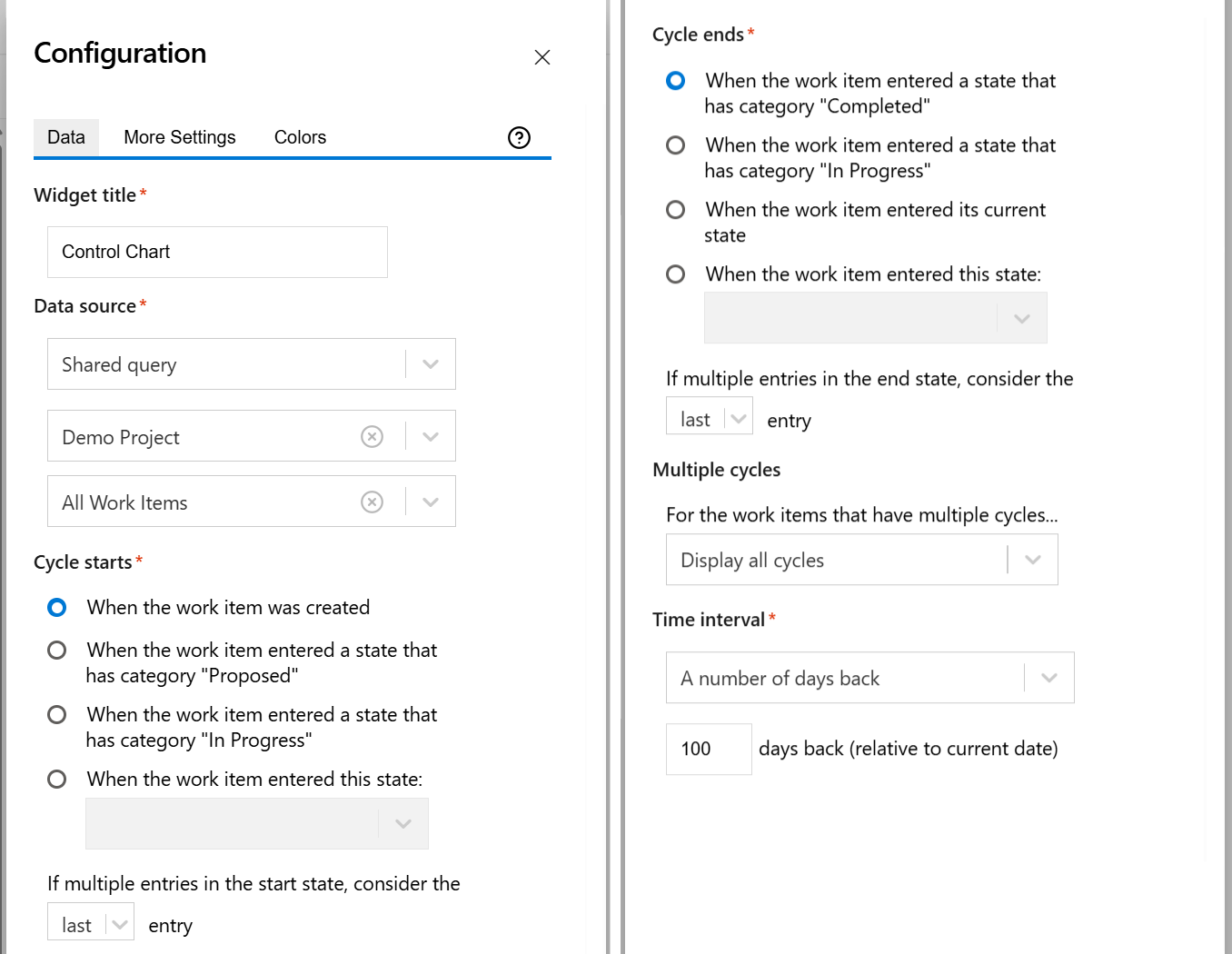
Configuration
The settings of this widget are divided in multiple tabs:
-
Data tab - contains the required settings of the widget, such as title or data source
-
More Settings tab - contains the optional settings
-
Colors tab - lets you customize the color of the lines displayed in the chart
Data tab
On this tab you can configure the required settings of the widget.
|
Setting |
Description |
|---|---|
|
Widget title |
Choose what to display in the title bar of the widget. |
|
Data source |
Select the type of Data Source used by the widget:
|
|
Cycle starts |
Indicates what to consider as the start event of a cycle. You can choose between:
Example
If you set If multiple entries in the start state, consider the first entry, the cycle will start when the item was transitioned in the "In Progress" state for the first time. 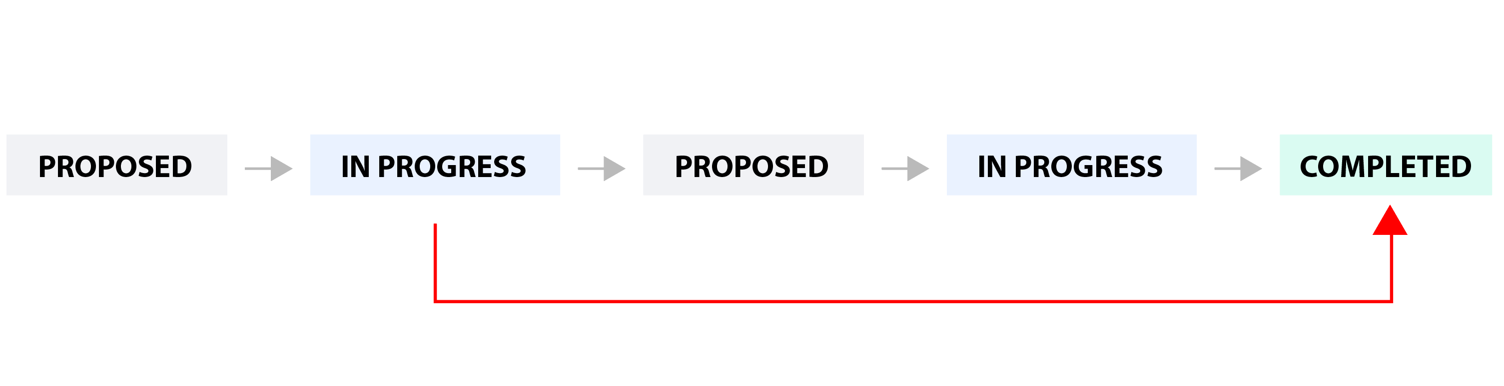
If you set If multiple entries in the start state, consider the last entry, the cycle will start when the item was transitioned in the "In Progress" state for the last time. 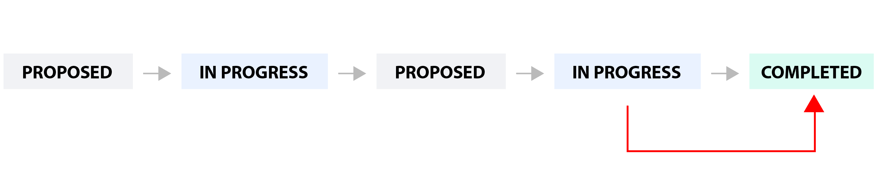
|
|
Cycle ends |
Indicates what to consider as the end event of a cycle. You can choose between:
You can also choose how to handle the case when there are multiple transitions to the end state by setting If multiple entries in the end state, consider the ? entry to first or last. See the example below. Example

If you set If multiple entries in the end state, consider the first entry, the cycle will end when the work item was transitioned in the "Completed" state for the first time. 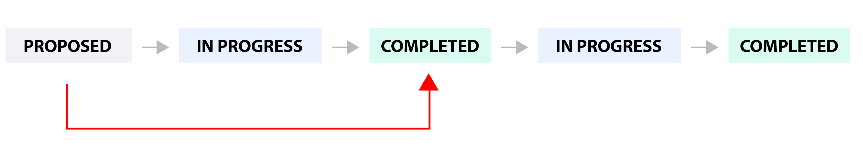
If you set If multiple entries in the end state, consider the last entry, the cycle will end when the work item was transitioned in the "Completed" state for the last time. 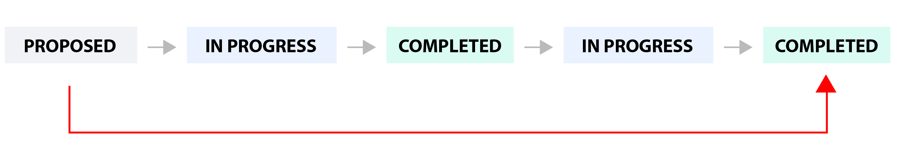
|
|
Multiple cycles |
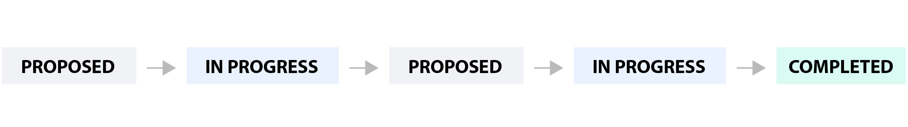
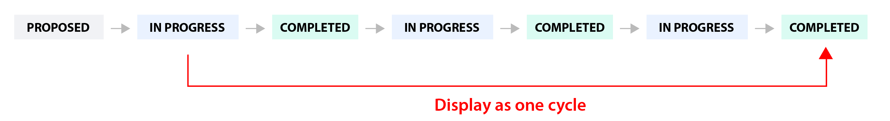
Decide how the widget should handle those work items that have multiple cycles. This situation occurs if the work item was transitioned multiple times through the start and finish states of the cycle. Example
You can choose between:
|
|
Time interval |
Represents the time interval displayed by the widget. You can choose from multiple options: Custom dates - choose this option if you want to manually enter a Start date and an End date. A number of days back - By choosing this option, the widget will use a rolling time interval with a number of days back to the current day. Dates of a sprint - Choose this option if you want the widget to use the start and end dates of an existing sprint. Only the dates are considered (not also the hours). The start of the interval will be the start date of the sprint with time at the start of day, while the end of the interval will be the end date of the sprint with the time at the end of day. When enabled, you’ll need to select the project and team the sprint belongs to. If you choose the Latest sprint (auto), the date range will automatically match the most recent sprint. If you manually select a specific sprint, any changes made to its dates on the board will be automatically reflected in the widget, without the need to reconfigure it. |
More Settings tab
On this tab you can configure the optional settings of the widget.
|
Setting |
Description |
|---|---|
|
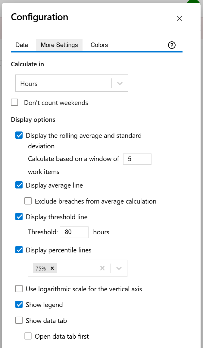
Calculate in |
Choose the time unit in which the results will be displayed. |
|
Display rolling average line and standard deviation |
Check this option if you want the chart to display the rolling average line, which allows visualizing the trend, along with the standard deviation that allows identifying the outliers. You must also specify the odd number of X items representing the window used for calculating the rolling average and the standard deviation. The rolling average and standard deviation are item-based, not time-based. For every item shown on the chart, the rolling average and the standard deviation (at that point in time) are calculated by taking the item itself, X/2 items before the item and X/2 items after the item, then averaging their cycle times. For example, if you choose to calculate based on a 15-items window, the calculation will be based on the item itself, with 7 items to the left and 7 items to the right. |
|
Display average line |
Check this option if you want the chart to display a line with the average cycle time for the specified time interval. |
|
Don't count weekends |
Check this option if you want to exclude the weekends (Saturdays and Sundays) from the cycle time calculation. |
|
Display threshold line |
Check this option if you want the chart to display a line representing a threshold. The items that have a cycle time higher than the specified Threshold value will be colored in red. |
|
Exclude breaches from average calculation |
Check this option if you want the average calculation to exclude items that exceeded the set threshold (breaches). This option has no effect if no threshold is set. |
|
Display percentile lines |
Select this option and enter the values (percentages) for the percentiles you want to display. A percentile is a value that divides the data set into two parts: the lower part contains the specified percentage of the data, and the upper part contains the remainder. For example, the 75th percentile will appear as a horizontal line with 75% of the items below it and 25% above it. |
|
Use logarithmic scale for the vertical axis |
Check this option if you want the chart to display a logarithmic scale instead of a linear scale for the Y axis. |
|
Show legend |
Check this option if you want the chart legend to be displayed. |
|
Show data table |
Check this option if you want a data table to be displayed along with the chart. The Data tab displays the items along with their cycle time details and the average calculation. |
|
Open data tab first |
Check this option if you want the widget to open on the Data tab first (instead of Chart tab as default). Note that the tab order will remain unchanged (Chart, then Data); only the initial view will switch to the Data tab. |
Colors tab
On this tab you can customize the color of the lines displayed in the chart.
|
Setting |
Description |
|---|---|
|
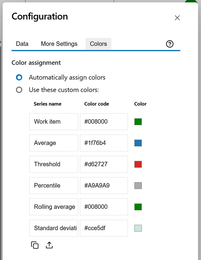
Automatically assign colors |
Check this if you want the chart to automatically assign colors for the series. |
|
Custom colors |
Select any custom color you want the series to be displayed on by either entering the color's hexadecimal code or picking a color. You can also use the Copy and Import buttons to copy and import the color configuration to widgets of the same type. |