Overview
The Pivot Table & Pivot Chart widget allows you to create and display pivot tables or pivot charts based on items in your projects using an intuitive drag-and-drop interface, similar to tools like Excel.
A pivot table is a data-summarization tool that helps you organize, group, and analyze data in a clear and manageable way. It transforms large datasets into concise, actionable reports by performing operations such as summing, averaging, or counting values based on selected fields.
With this widget, you can build multi-dimensional tables directly on your dashboards, making complex project data easier to understand and analyze. It can calculate not only the count of work items, but also sum of numerical fields and percentages.
A pivot chart is a visual representation of the data in a pivot table. It helps you quickly identify patterns, trends, and comparisons by presenting summarized data graphically.
The widget supports the configuration of multi-dimensional pivot tables, including simple tables and heat maps, as shown in the examples below.
The widget allows you to choose from various types of pivot charts: column charts, line charts, bar charts, stack area charts or pie charts.
Configuration
The settings of this widget are divided in multiple tabs:
-
Data tab - contains the required settings of the widget, such as title or data source
-
More Settings tab - contains the optional settings
-
Colors tab - lets you choose the base color of the heatmap table
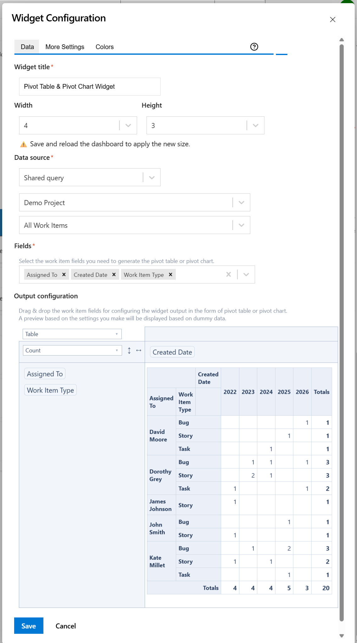
Follow the steps below to configure the widget as Pivot Table or Pivot Chart:
-
Add the Pivot Table & Pivot Chart widget to your dashboard.
-
Enter a suggestive Widget title.
-
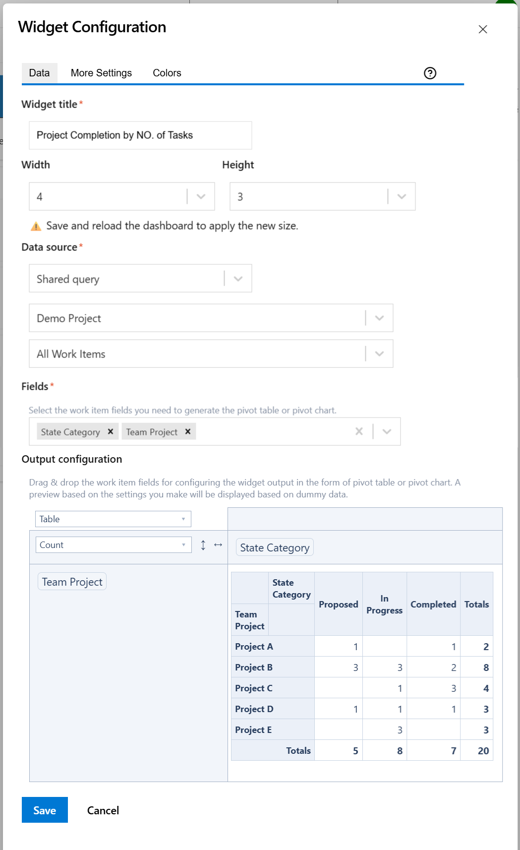
At Data Source, select the query that returns the items that serve as input data for the pivot table or pivot chart.
-
At Fields, select the fields that you need in your pivot table or pivot chart.
-
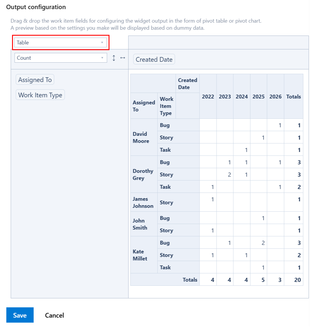
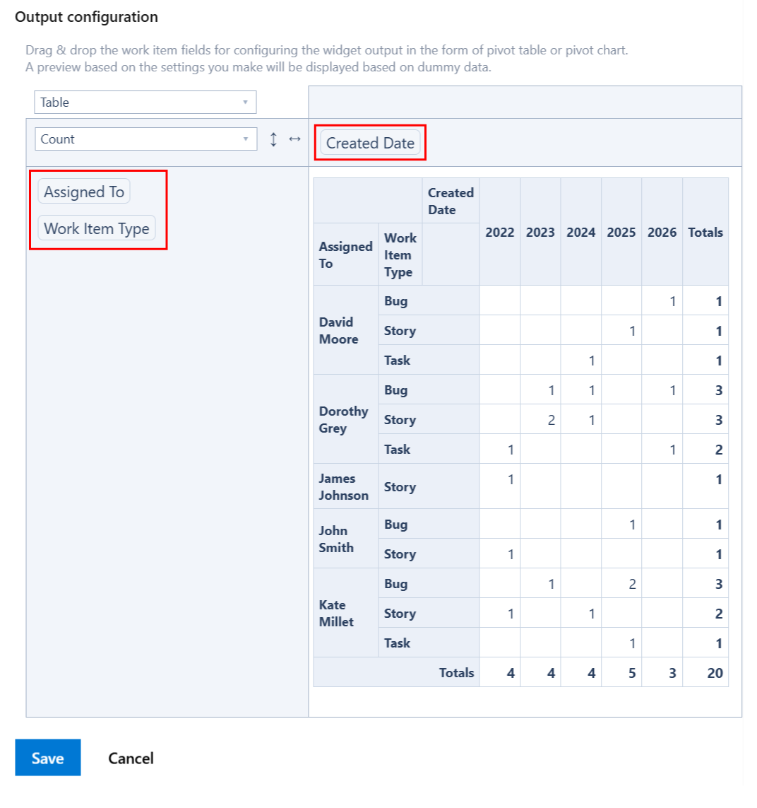
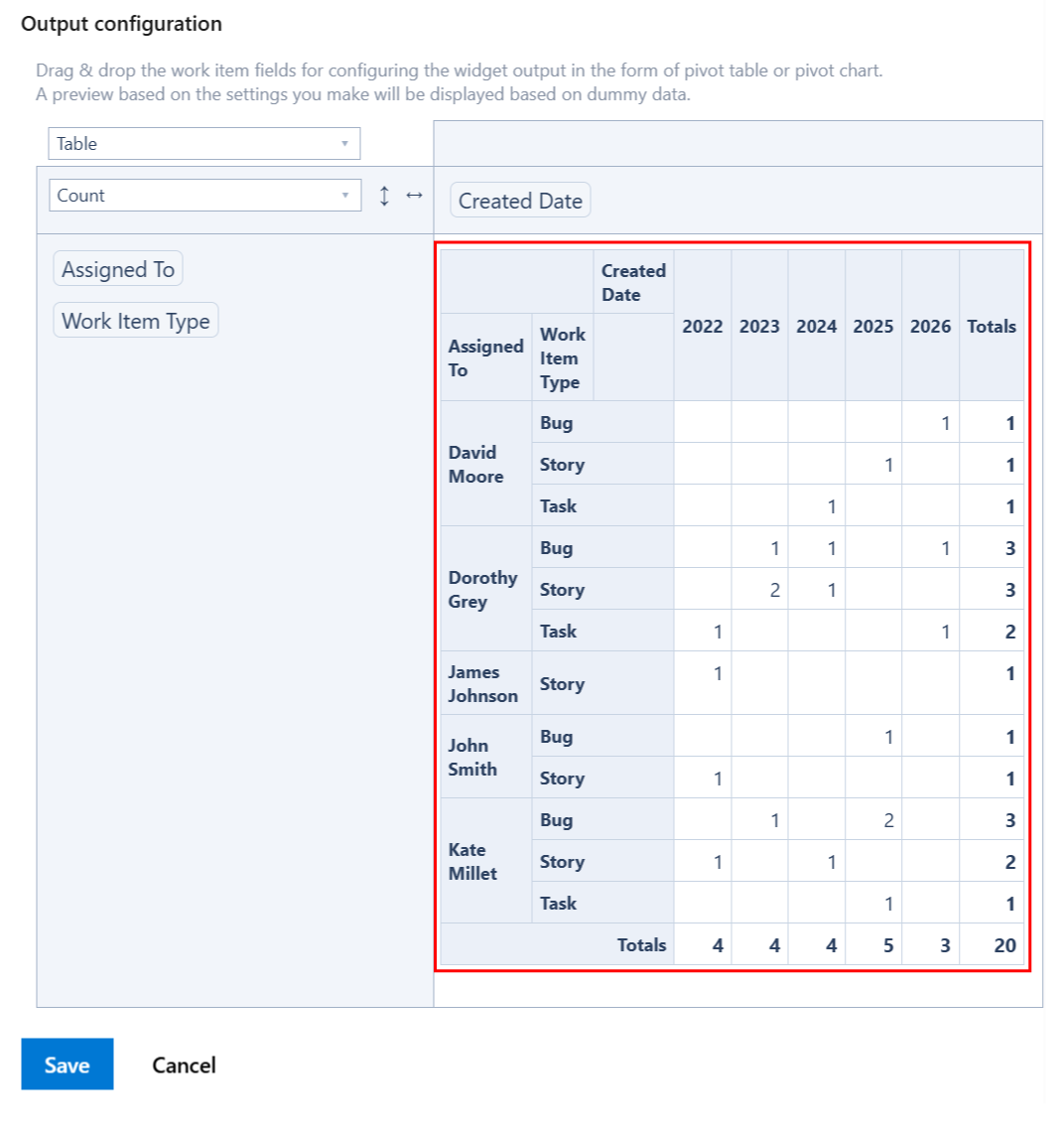
The table from the Output configuration section allows you to configure the pivot table or pivot chart by dragging and dropping the selected fields into rows and columns.
-
In the top-right cell, select the type of the output data: pivot table or pivot chart.
-
If you want to display the results as a regular pivot table, select Table. Or, select Table Heatmap to display the results as a heatmap-capable table where the values of interest are highlighted in shades of red.
-
If you want to display as a pivot chart, select the appropriate option for the type of chart you want.
-
By using drag & drop, place the fields that you want to be displayed on the columns and the rows of the table.
-
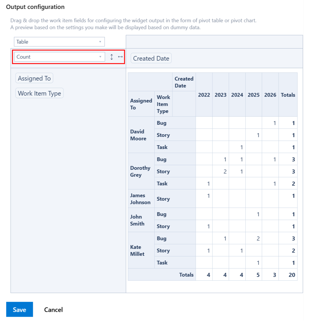
Choose the calculation criteria. You can choose between various options. For example, to display the number of items in table, select Count
-
If you want to display the sum of an item field (like Story Points), select Sum and then the select field; make sure the field that you want to sum-up was added to the Fields option above.
-
A preview of the widget results is displayed based on the configuration you made and using some randomly generated dummy data.
-
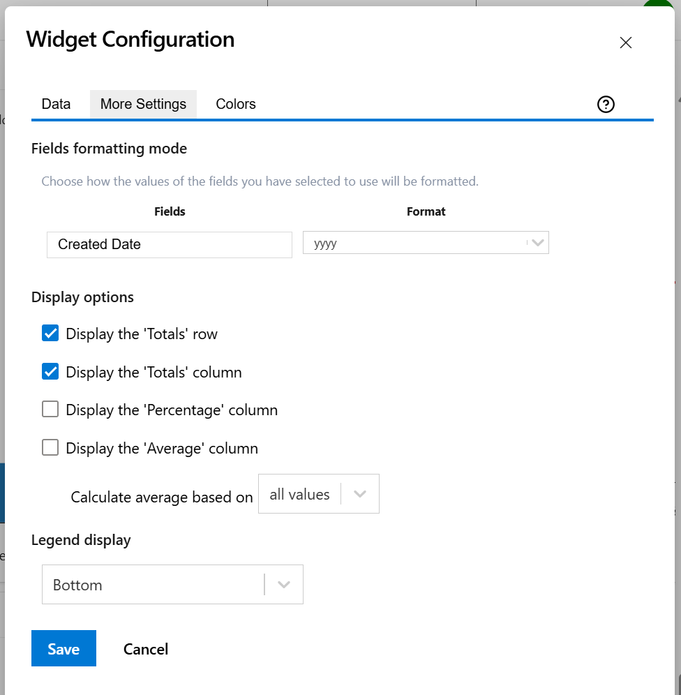
On the More Settings tab, you can choose the display format for the fields that you selected for being used in the Pivot Table or Pivot Chart.
For example, for date fields like Created or Updated you can choose a format like “MM/dd/yyyy” or “yyyy”, while for time fields like Completed Work or Original Estimate you may choose to display the result in “Hours” or “Calendar Days (24h)”.
-
Make any adjustments as necessary and when you are done, click Save.
Data tab
On this tab you can configure the required settings of the widget.
|
Setting |
Description |
|---|---|
|
Widget title |
Choose what to display in the title bar of the widget. |
|
Data source |
Select the type of Data source used by the widget:
|
|
Fields |
Select the fields you need to generate the pivot table or pivot chart. |
|
Output configuration |
This is the place where you can configure the pivot table or pivot chart. 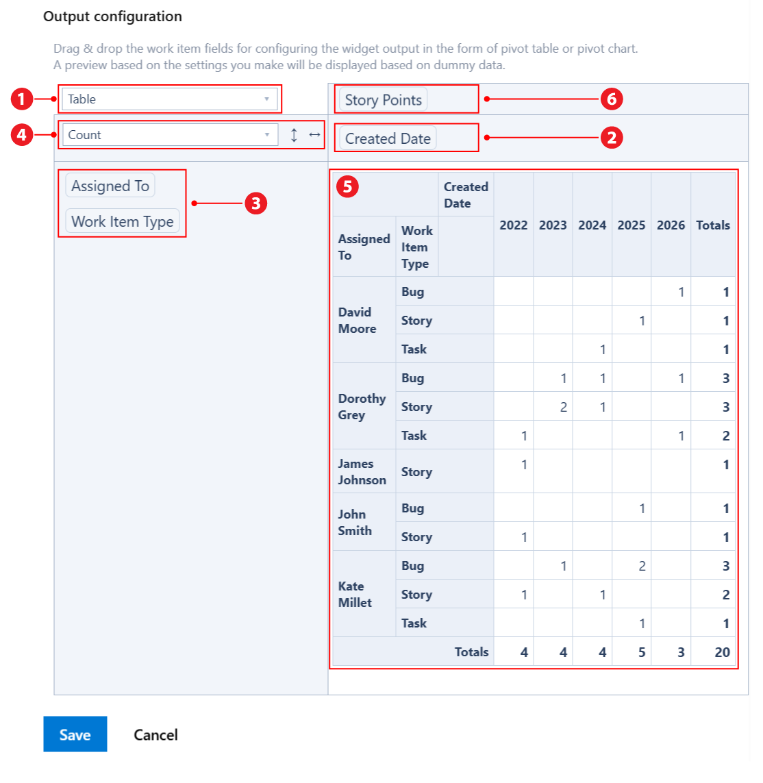
Note If you drag & drop a field between the columns area
|


More Settings tab
On this tab you can configure the optional settings of the widget.
|
Setting |
Description |
|---|---|
|
Fields formatting mode |
For the fields that you selected on the Data tab you may specify the format to be used for displaying their values. For example, for date fields like Created Date you can choose a format like “MM/dd/yyyy” or “yyyy”. To display quarters of the year, choose a format that contains “Q“, such as “Q yyyy“ or “yy-Q“. To display weeks of the year, choose “Week dd MMM yy“ or “Week of MMM dd, yyyy“. Also, you can choose a format that contains “ww“, such as “ww yyyy“ or “yy-ww“. |
|
Display the 'Totals' row |
Check this option if you want the pivot table to display the 'Totals' row. It takes effect only if the widget is configured as Table, Table Heatmap, Table Col Heatmap or Table Row Heatmap. |
|
Display the 'Totals' column |
Check this option if you want the pivot table to display the 'Totals' column. It takes effect only if the widget is configured as Table, Table Heatmap, Table Col Heatmap or Table Row Heatmap. |
|
Display the 'Percentage' column |
Check this option if you want the pivot table to display the 'Percentage' column. It takes effect only if the widget is configured as Table, Table Heatmap, Table Col Heatmap or Table Row Heatmap. The percentage value on a row is calculated based on the value of the Total cell from the same row as a fraction of the Grand Total value. |
|
Display the 'Average' column |
Check this option if you want the pivot table to display the 'Average' column. It takes effect only if the widget is configured as Table, Table Heatmap, Table Col Heatmap or Table Row Heatmap. You can choose to Calculate the average based on:
|
|
Legend display |
This setting only applies to pivot charts. Indicates whether the chart legend should be displayed or not and where exactly. |
Colors tab
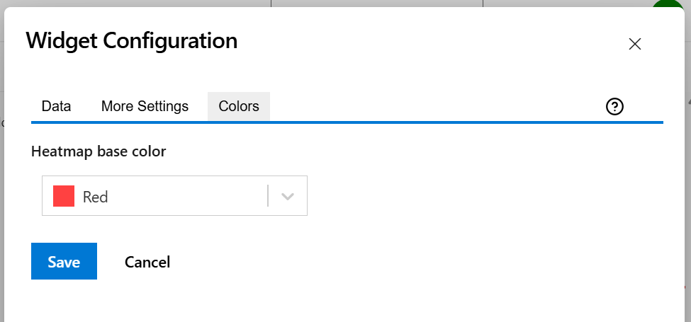
On this tab you can choose the base color for the heatmap table.
|
Setting |
Description |
|---|---|
|
Heatmap base color |
This option lets you adjust the hue (color tone) used to generate the heatmap color palette. It applies only when the widget output is set to Table Heatmap, Table Column Heatmap, or Table Row Heatmap. The widget also automatically adjusts the text color based on the background color to ensure optimal readability. |
More Examples
Here are more examples of using this widget.
Projects Completion
There are various ways for displaying the progress of your projects.
Projects by No. of Tasks in each State Category
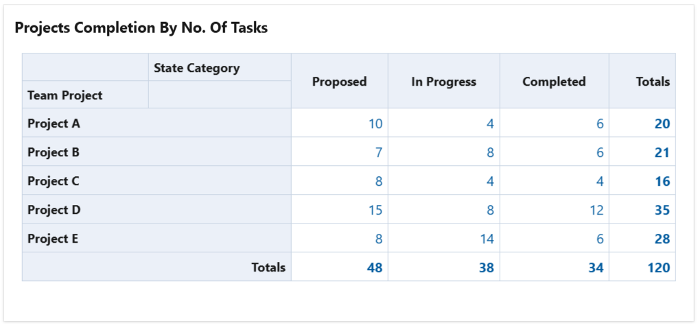
To achieve this, configure the widget with a query that returns work items (stories, tasks, bugs, etc) from the projects that you want to track. Then configure the widget to calculate the Count as in the example below.
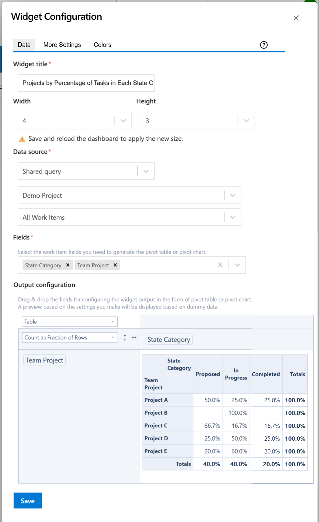
Projects by Percentage of Tasks in each State Category
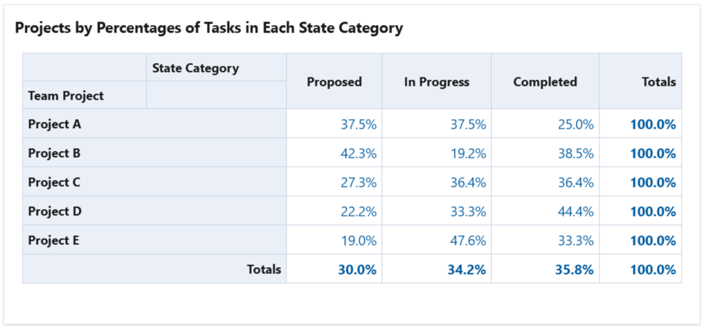
To achieve this, configure the widget with a query that returns work items (stories, tasks, bugs, etc) from the projects that you want to track. Then configure the widget to calculate the Count as Fraction of Rows as in the example below.