
Overview
The Cumulative Flow Diagram (CFD) widget helps you evaluate the stability of your workflow and identify areas that may need attention to make your process more predictable.
The Cumulative Flow Diagram is one of the most advanced analytics in Agile project management. It offers both quantitative and qualitative insights into how work moves through your process.
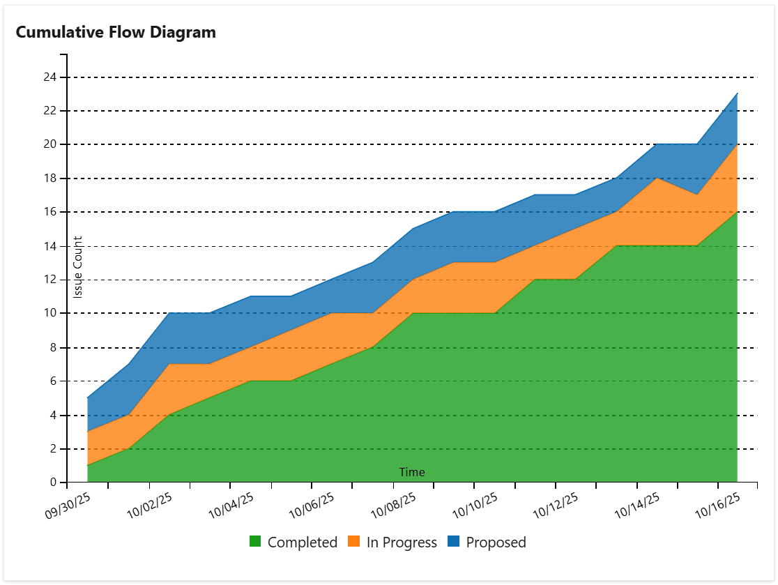
This widget displays the cumulative flow diagram (CFD) for the work items of a board or a shared query. It is a stacked area chart that shows the amount of work (as number of items, sum of story points or hours, or sum of a numeric custom field) in each workflow state, state category or board column over time. When you view the data for a particular day, you will know how many work items were present in each column at the end of that day.
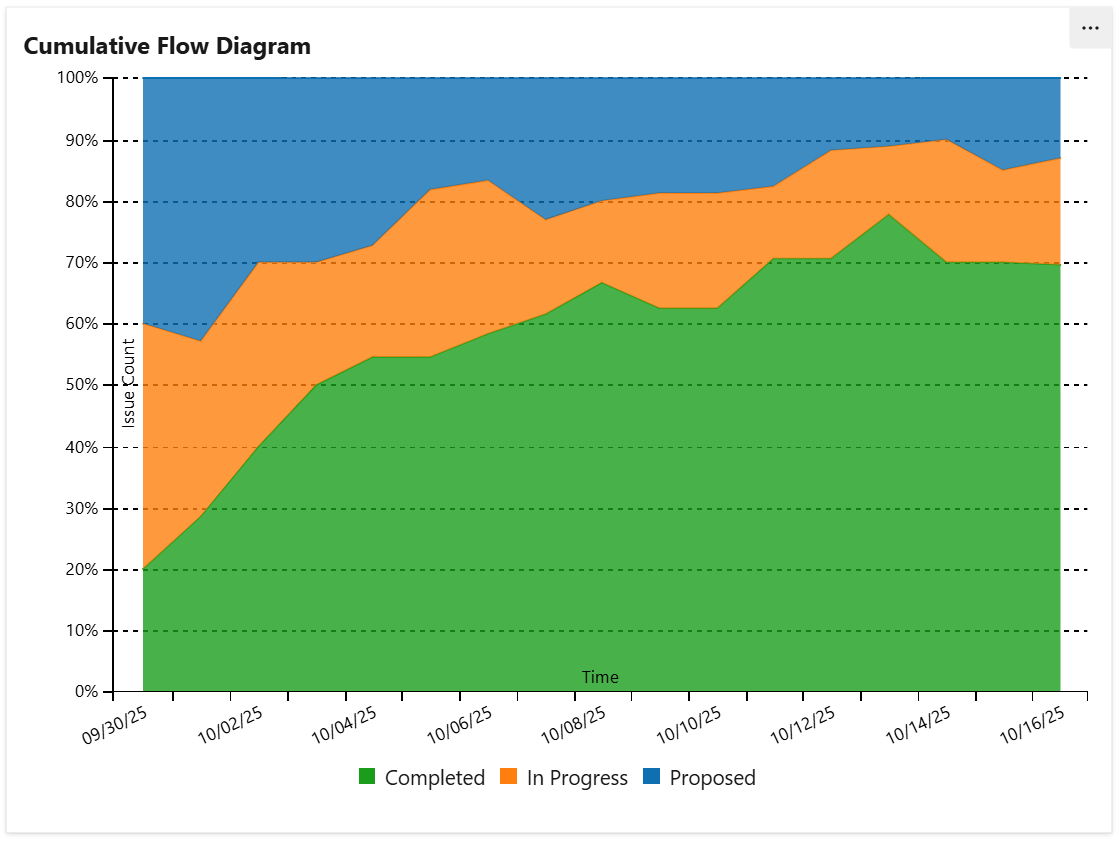
The widget can be configured to display the chart as percentage of total:
Depending on how it was configured, the chart displays multiple series (or "bands"). In these examples the bands are:
Completed - The total number of done work items. Depending on the widget settings, "done" means all the items with state category "completed" or the items in the last column of the selected board.
In Progress - The total number of "In progress" items. Depending on the widget’s settings, "in progress" means all the items with the state category "in progress" or the items in the middle column(s) of the selected board.
Proposed - The total number of “to do“ work items. Depending on the widget’s settings, "to do" means all the items with the state category "Proposed" or the items in the first column of the selected board.
Also, if so configured, the widget can display bands that correspond to the columns of a selected board. In this case, the series names will be the same as the column names.
Configuration
The settings of this widget are divided in multiple tabs:
-
Data tab - contains the required settings of the widget, such as title or data source
-
More Settings tab - contains the optional settings
-
Colors tab - lets you customize the color of the lines displayed in the chart
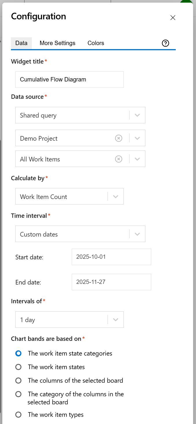
Data tab
On this tab you can configure the required settings of the widget.
|
Setting |
Description |
|---|---|
|
Widget title |
Choose what to display in the title bar of the widget. |
|
Data source |
Select the type of Data source used by the widget:
|
|
Calculate by |
Specify on which criteria the calculation is to be performed. You can choose between:
|
|
Time interval |
Represents the time interval displayed by the widget. You can choose from multiple options: Custom dates - choose this option if you want to manually enter a Start date and an End date. Dates of a sprint - Choose this option if you want the widget to use the start and end dates of an existing sprint. Only the dates are considered (not also the hours). The start of the interval will be the start date of the sprint with time at the start of day, while the end of the interval will be the end date of the sprint with the time at the end of day. When enabled, you’ll need to select the project and team the sprint belongs to. If you choose the Latest sprint (auto), the date range will automatically match the most recent sprint. If you manually select a specific sprint, any changes made to its dates on the board will be automatically reflected in the widget, without the need to reconfigure it. A number of days back - By choosing this option, the widget will use a rolling time interval with a number of days back to the current day. You can also check the Continue to display data after end date option in the More Settings tab if you want the chart to still display data even if the end date has passed. |
|
Intervals of |
Indicates the length of the intervals displayed on the horizontal axis. |
|
Chart bands are based on |
Specify by which criteria the bands displayed in the chart are determined. You can choose between:
The work item states - when using this option, each workflow state that is mapped on the columns of the selected board has a corresponding band in the chart. If a query is selected, the chart displays a band for each of the workflow states reached by the items from the query. The columns of the selected board - when using this option, each column of the board has a corresponding band in the chart, displaying the number of items in that column.
The work item types - when using this option, each work item type has a corresponding band in the chart, displaying the number of work items of that type. |
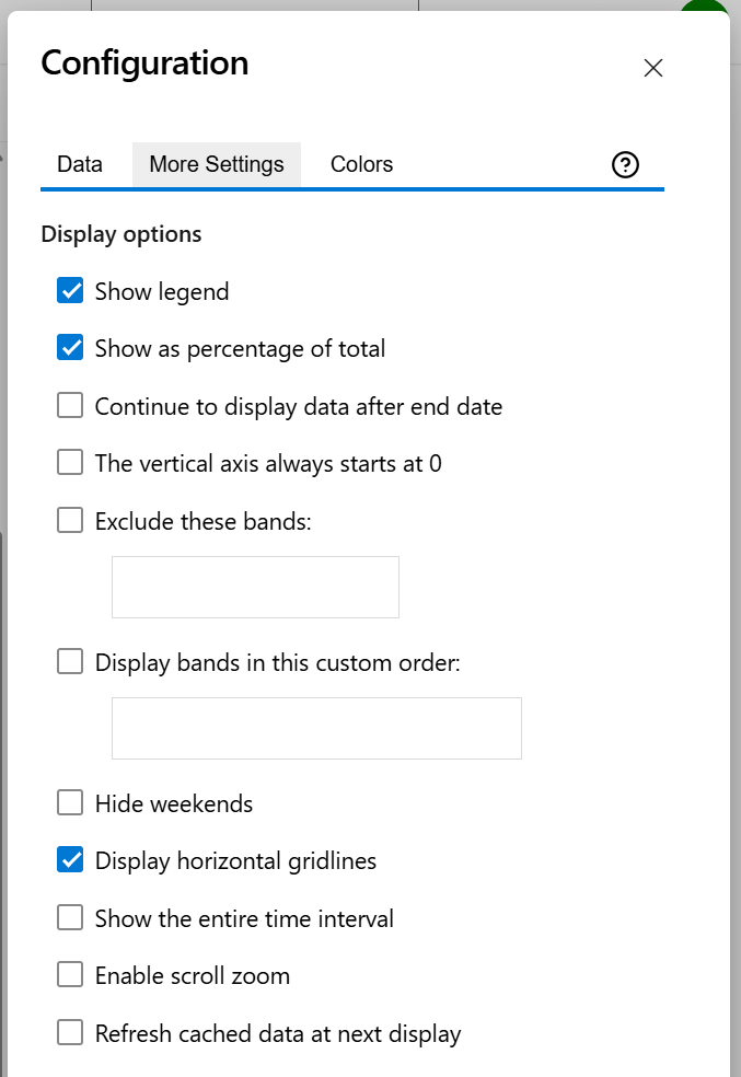
More Settings tab
On this tab you can configure the optional settings of the widget.
|
Setting |
Description |
|---|---|
|
Show legend |
Check this if you want the chart legend to be displayed. |
|
Show as percentage of total |
Check this option if you want the chart to display percentages of total instead of the calculated values. |
|
Continue to display data after end date |
Check this option if you want the chart to still display data even if the end date passed. |
|
The vertical axis always starts at 0 |
Check this option if you want the vertical axis to always start at 0. |
|
Exclude these bands |
Check this option if you want to chart to exclude certain bands. Type the band names separated with a comma. |
|
Display bands in this custom order |
Check this option if you want the chart to display bands in a custom order. Type the band names separated with a comma. Bands that are not specified will be still be shown after the ones you added. |
|
Hide weekends |
Check this option if you want the chart not to show weekend days (Saturday and Sunday). |
|
Display horizontal gridlines |
Check this option if you want the chart to display gridlines for the vertical axis. |
|
Show the entire time interval |
Check this option if you want the chart to display the entire time interval. |
|
Enable scroll zoom |
Check this if you want to be able to zoom-in while scrolling with the mouse wheel over the chart. |
|
Refresh cached data at next display |
This widget uses data caching for faster display, which means that some data resulted after processing are saved and reused next time the widget is loaded. If you check it, the cache of the widget will be deleted and recreated at the next reload. This setting is not persistent. |
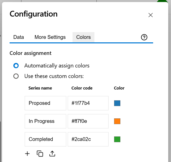
Colors tab
On this tab you can customize the color of the lines displayed in the chart.
|
Setting |
Description |
|---|---|
|
Automatically assign colors |
Check this if you want the chart to automatically assign colors for the series. |
|
Custom colors |
Select any custom color you want the series to be displayed on by either entering the color's hexadecimal code or picking a color. By default, only the common series are listed, but you can use the Add (+) button to add additional series to the table. You can also use the Copy and Import buttons to copy and import the color configuration to widgets of the same type. |