
Overview
The WIP Run Chart shows the amount of work in progress (WIP) over time for a team or process. WIP can be calculated either as the number of work items that have been started but not yet finished, or as the sum of their estimates, such as story points.
The WIP Run Chart helps identify trends or patterns in your work process, such as bottlenecks, fluctuations, or improvements, and provides insights into achieving a stable and sustainable pace. It can also help monitor and control WIP levels, which is an important aspect of Kanban and other agile frameworks.
%20run%20chart%20in%20Azure%20DevOps%20dashboard.png?cb=d438decac84ace52ee0a604542226625)
The WIP Run Chart has two axes: the x-axis represents the timeline, and the y-axis represents the WIP amount. Each data point shows the total WIP for a specific day or time period. An optional trend line can be displayed to highlight the direction and rate of change of your WIP over time, while optional WIP limit thresholds can be used to highlight any WIP breaches.
Configuration
The settings of this widget are divided in multiple tabs:
-
Data tab - contains the required settings of the widget, such as title or data source
-
More Settings tab - contains the optional settings
-
Colors tab - lets you customize the color of the lines displayed in the chart
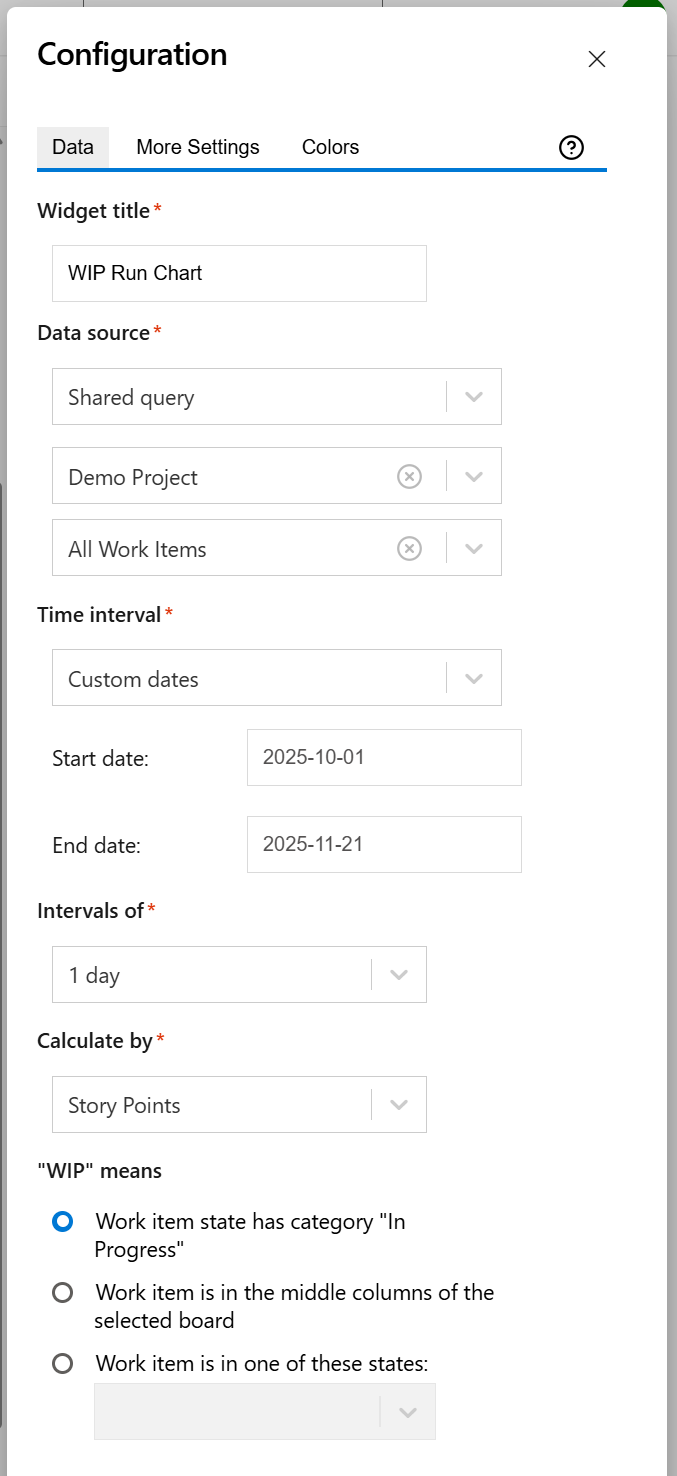
Data tab
On this tab you can configure the required settings of the widget.
|
Setting |
Description |
|---|---|
|
Widget title |
Choose what to display in the title bar of the widget. |
|
Data source |
Select the type of Data Source used by the widget:
|
|
Time interval |
Represents the time interval displayed by the widget. You can choose from multiple options: Custom dates - choose this option if you want to manually enter a Start date and an End date. A number of days back - By choosing this option, the widget will use a rolling time interval with a number of days back to the current day. Dates of a sprint - Choose this option if you want the widget to use the start and end dates of an existing sprint. Only the dates are considered (not also the hours). The start of the interval will be the start date of the sprint with time at the start of day, while the end of the interval will be the end date of the sprint with the time at the end of day. When enabled, you’ll need to select the board the sprint belongs to. If you choose the Latest sprint (auto), the date range will automatically match the most recent sprint. If you manually select a specific sprint, any changes made to its dates on the board will be automatically reflected in the widget, without the need to reconfigure it. You can also check the Continue to display data after end date option in the More Settings tab if you want the chart to still display data even if the end date has passed. |
|
Intervals of |
Indicates the length of the intervals displayed on the horizontal axis. |
|
Calculate by |
Specify on which criteria the calculation is to be performed. You can choose between:
|
|
"WIP" means |
Specify how to consider the item as being work-in-progress (WIP). |
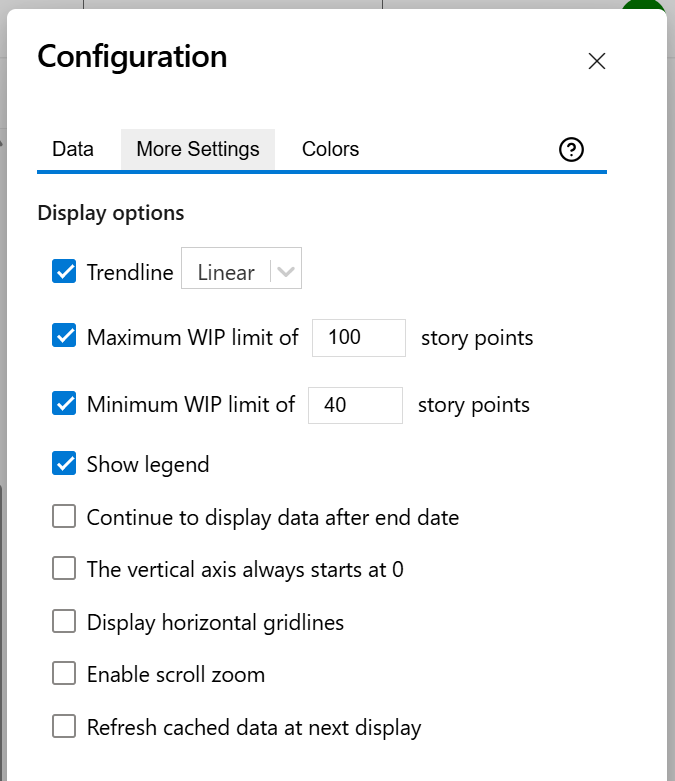
More Settings tab
On this tab you can configure the optional settings of the widget.
|
Setting |
Description |
|---|---|
|
Trendline |
Check this option to display a line on the chart that reveals the overall direction of the data. The trendline can be:
|
|
Maximum WIP limit |
Check this option if you want the chart to display a horizontal line representing a maximum limit. The work items that have exceeded this limit and are above the horizontal line will be highlighted in red, and will be included in the WIP Breaches count displayed at the top of the chart. |
|
Minimum WIP limit |
Check this option if you want the chart to display a horizontal line representing a minimum limit. The work items that have not met this limit and are below the horizontal line will be highlighted in red, and will be included in the WIP Breaches count displayed at the top of the chart. |
|
Show legend |
Check this option if you want the chart legend to be displayed. |
|
Continue to display data after end date |
Check this option if you want the chart to still display data even if the end date passed. |
|
The vertical axis always starts at 0 |
Check this option if you want the vertical axis to always start at zero. If unchecked, the chart will automatically determine the minimum value of the vertical axis for optimal visibility. |
|
Display horizontal gridlines |
Check this option if you want the chart to display gridlines for the vertical axis. |
|
Enable scroll zoom |
Check this if you want to be able to zoom-in while scrolling with the mouse wheel over the chart. |
|
Refresh cached data at next display |
This widget uses data caching for faster display, which means that some data resulted after processing are saved and reused next time the widget is loaded. If you check it, the cache of the widget will be deleted and recreated at the next reload. This setting is not persistent. |
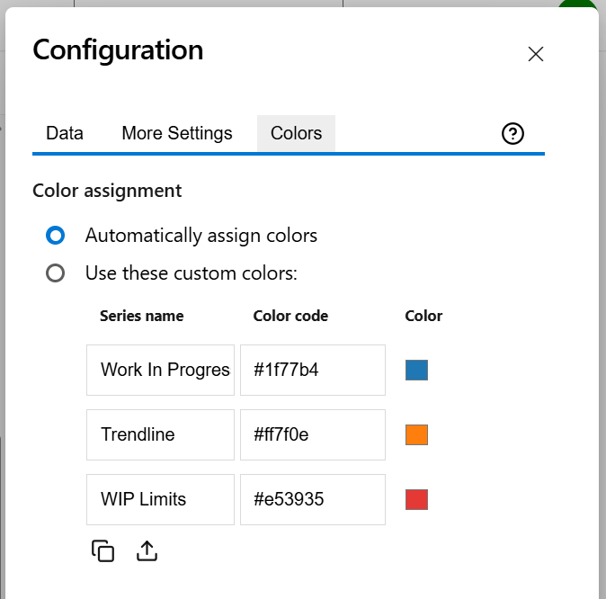
Colors tab
On this tab you can customize the color of the lines displayed in the chart.
|
Setting |
Description |
|---|---|
|
Automatically assign colors |
Check this if you want the chart to automatically assign colors for the series. |
|
Custom colors |
Select any custom color you want the series to be displayed on by either entering the color's hexadecimal code or picking a color. You can also use the Copy and Import buttons to copy and import the color configuration to widgets of the same type. |