
Overview
The Cycle Time Trend Chart widget helps you track how quickly your team delivers work and whether delivery performance improves over time.
Depending on how you configure it, this widget can calculate the key Kanban metrics like Cycle Time or Lead Time and display their trend, or simply measure the time between two workflow states.
-
Cycle Time is the amount of time that the team spent working on an item, excluding any waiting time on the board. Therefore, the Cycle Time should start being measured when the item task enters a "working" state, not earlier.
-
Lead Time represents the total time from when a request is made by the client and added to the board until it is fully completed and delivered to the client. So it is the total time the client is waiting for an item to be delivered.
How does it work?
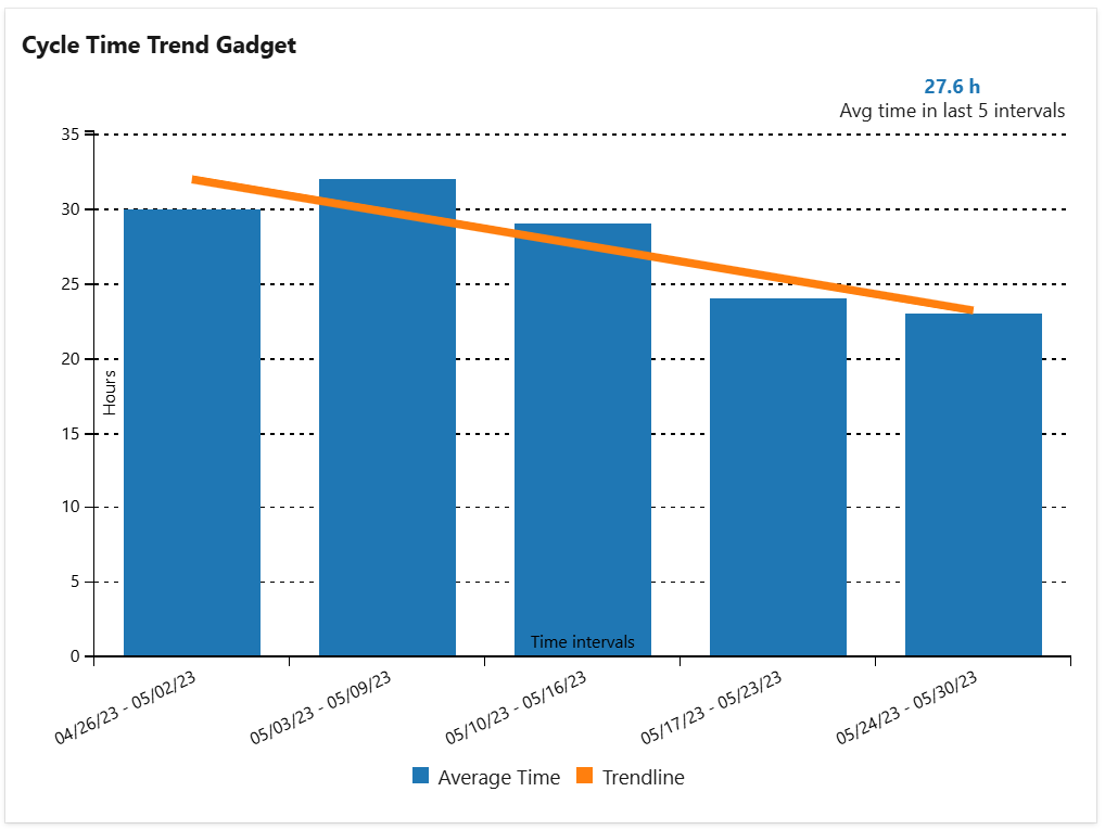
The data is displayed for a specified number of time intervals relative to a specified date. For each time interval, the widget identifies those worked items from the specified query that had a completed cycle in that interval, determines the cycle(s) duration, calculates the average time for that interval and displays it in the trend chart.
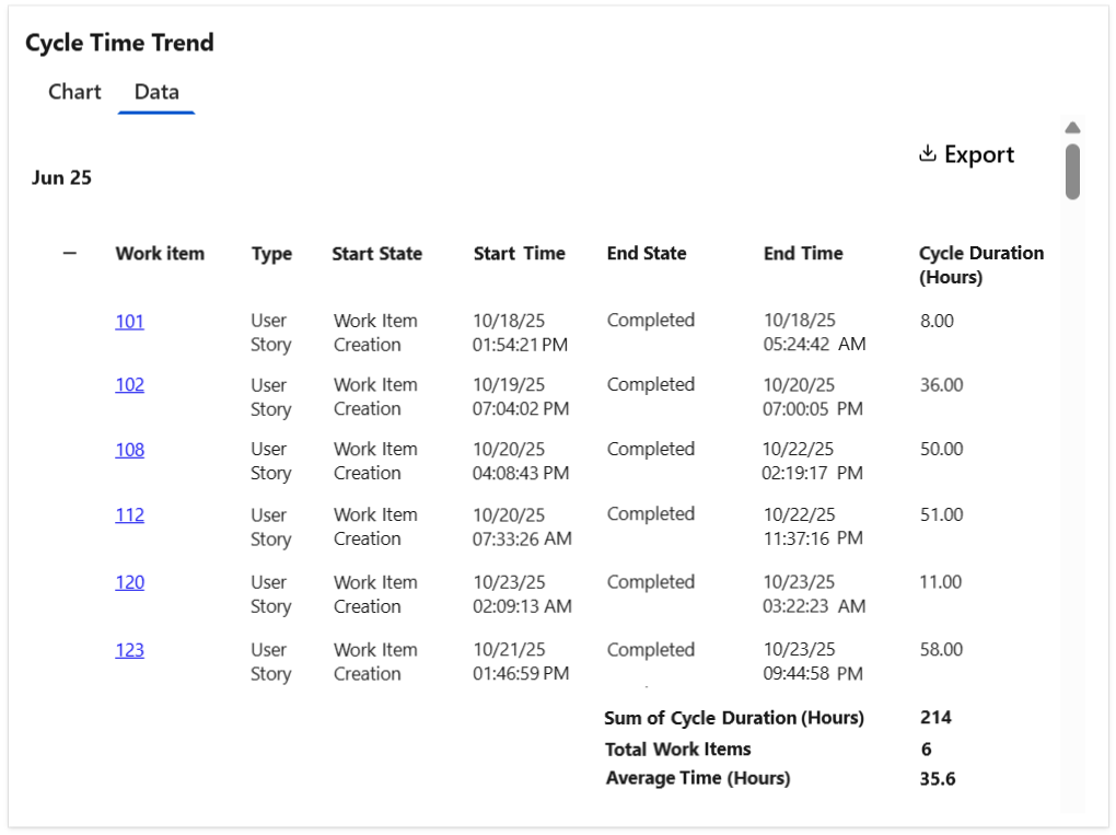
Optionally, the widget can display a Data tab with detailed information for each work item shown in each interval, including the cycle time details and the average calculation. The table can be easily exported as a CSV file.
Tips & Tricks
To calculate "Cycle Time", set the following:
-
Cycle starts = When the item entered a state that has category "In Progress"
-
Cycle ends = When the item entered a state that has category "Completed"
To calculate "Lead Time", set the following:
-
Cycle starts = When the item was created or when the item entered a state that has category "Proposed"
-
Cycle ends = When the item entered a state that has category "Completed"
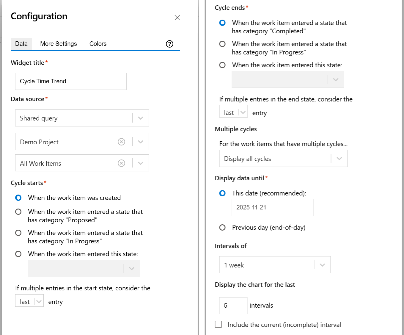
Configuration
The settings of this widget are divided in multiple tabs:
-
Data tab - contains the required settings of the widget, such as title or data source
-
More Settings tab - contains the optional settings
-
Colors tab - lets you customize the color of the lines displayed in the chart
Data tab
On this tab you can configure the required settings of the widget.
|
Setting |
Description |
|---|---|
|
Widget Title |
Choose what to display in the title bar of the widget. |
|
Data Source |
Select the type of Data Source used by the widget:
|
|
Cycle starts |
Indicates what to consider as the start event of a cycle. You can choose between:
Example
If you set If multiple entries in the start state, consider the first entry, the cycle will start when the item was transitioned in the "In Progress" state for the first time. 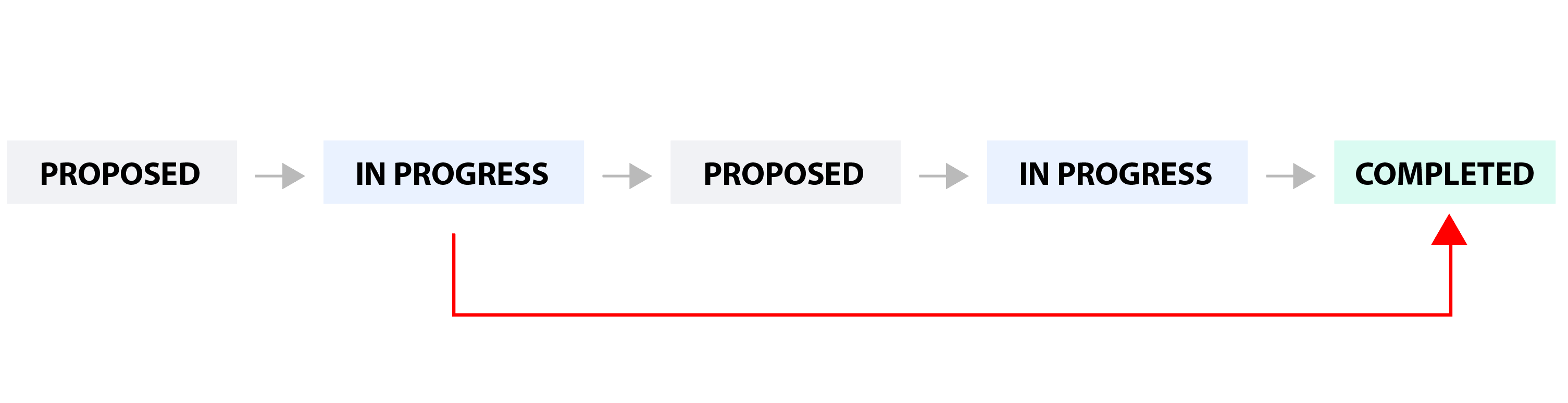
If you set If multiple entries in the start state, consider the last entry, the cycle will start when the item was transitioned in the "In Progress" state for the last time. 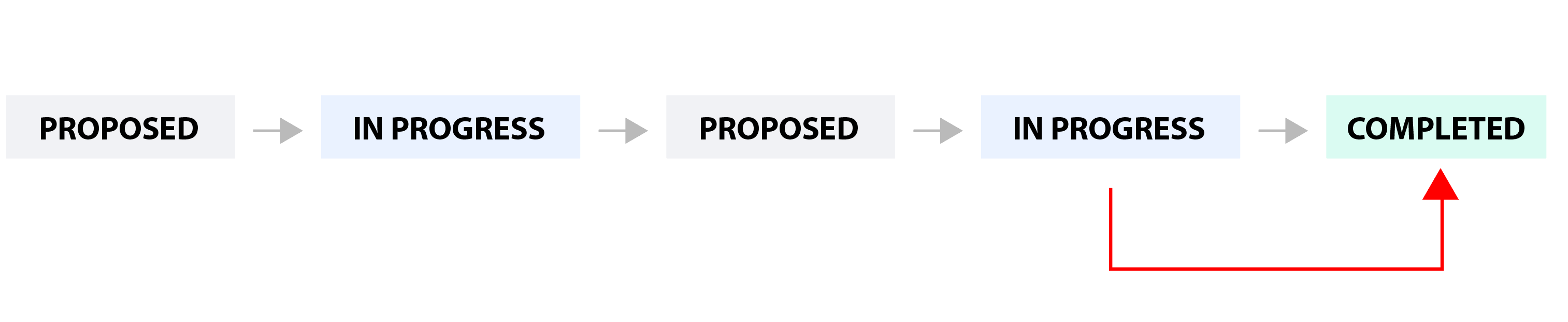
|
|
Cycle ends |
Indicates what to consider as the end event of a cycle. You can choose between:
You can also choose how to handle the case when there are multiple transitions to the end state by setting If multiple entries in the end state, consider the ? entry to first or last. See the example below. Example

If you set If multiple entries in the end state, consider the first entry, the cycle will end when the work item was transitioned in the "Completed" state for the first time. 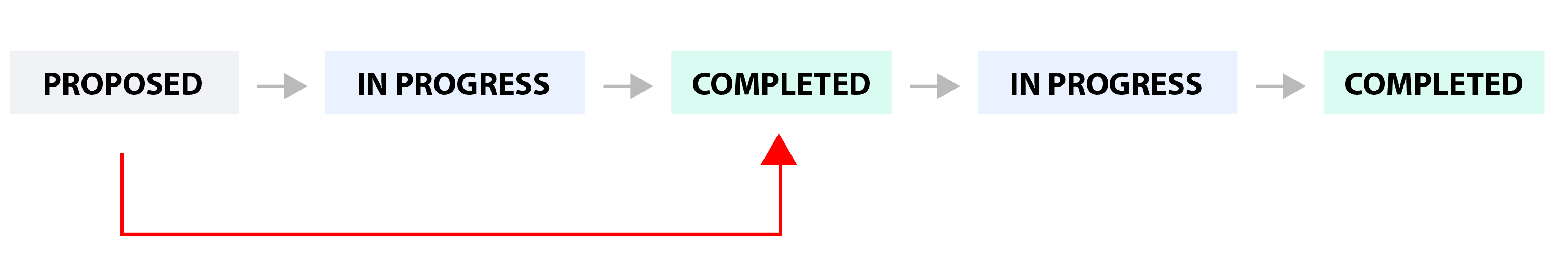
If you set If multiple entries in the end state, consider the last entry, the cycle will end when the work item was transitioned in the "Completed" state for the last time. 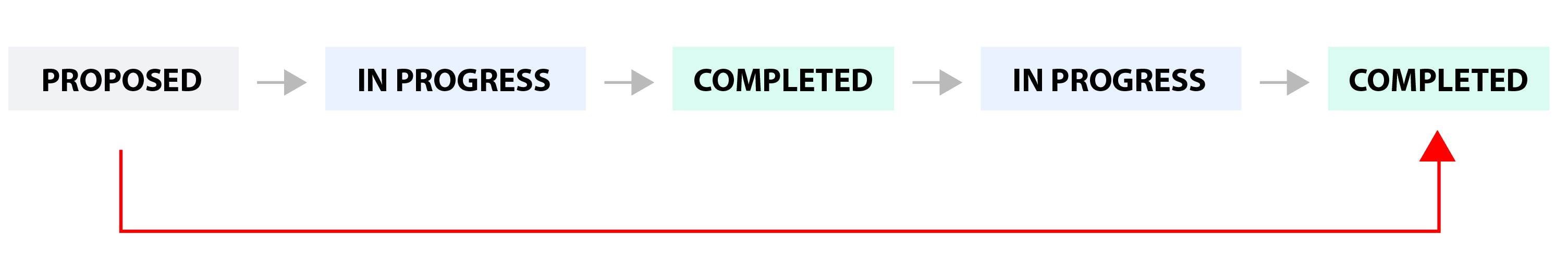
|
|
Multiple cycles |
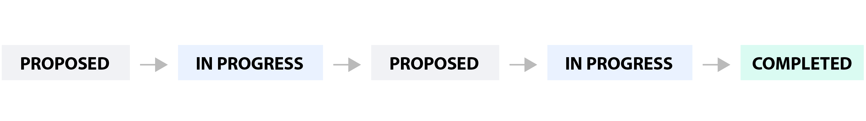
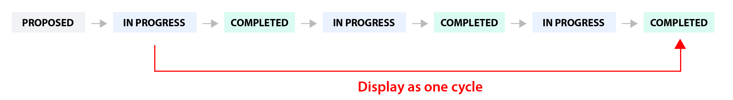
Decide how the widget should handle those work items that have multiple cycles. This situation occurs if the work item was transitioned multiple times through the start and finish states of the cycle. Example
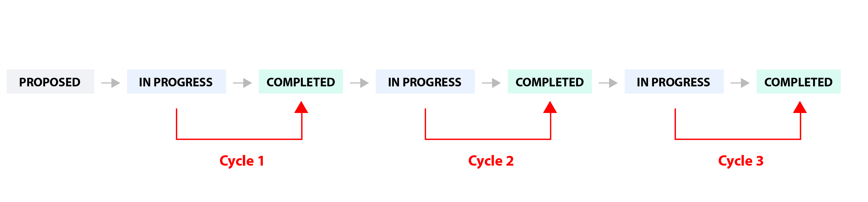
You can choose between:
|
|
Display data until |
Specify the date until the data is displayed. You can choose between: This date (recommended): - The time intervals will be aligned with the specified date.
|
|
Intervals of |
Specify the duration (in weeks) for the time intervals used when calculating and displaying the average time. |
|
Display the data for the last ? intervals |
Specify the number of time intervals to be displayed in the chart relative to the date specified at "Display data until". |
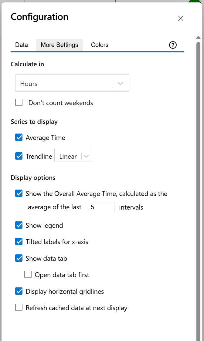
More Settings tab
On this tab you can configure the optional settings of the widget.
|
Setting |
Description |
|---|---|
|
Calculate in |
Choose the time unit in which the results will be displayed. |
|
Series to Display |
Choose what series to display in the chart. You can select one or more options:
|
|
Show the Overall Average Cycle Time, calculated as the average of the last ? intervals |
Check this option and specify a number of intervals, if you want the chart to calculate and display the overall average. |
|
Show legend |
Check this option if you want the chart legend to be displayed. |
|
Tilted labels for x-axis |
Check this option to avoid overlapping labels on the x-axis. |
|
Don't count weekends |
Check this option if you want to exclude the weekends (Saturdays and Sundays) from the cycle time calculation. |
|
Show data tab |
Check this option if you want a data table to be displayed along with the chart. The Data tab displays, for every time interval in the chart, the items along with their cycle time details and the average calculation. |
|
Open data tab first |
Check this option if you want the widget to open on the Data tab first (instead of Chart tab as default). Note that the tab order will remain unchanged (Chart, then Data); only the initial view will switch to the Data tab. |
|
Display horizontal gridlines |
Check this option if you want the chart to display gridlines for the vertical axis. |
|
Refresh cached data at next display |
This widget uses data caching for faster display, which means that some data resulted after processing are saved and reused next time the widget is loaded. If you check it, the cache of the widget will be deleted and recreated at the next reload. This setting is not persistent.
|
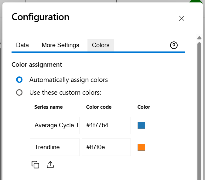
Colors tab
On this tab you can customize the color of the lines displayed in the chart.
|
Setting |
Description |
|---|---|
|
Automatically assign colors |
Check this if you want the chart to automatically assign colors for the series. |
|
Custom colors |
Select any custom color you want the series to be displayed on by either entering the color's hexadecimal code or picking a color. You can also use the Copy and Import buttons to copy and import the color configuration to widgets of the same type. |