
Overview
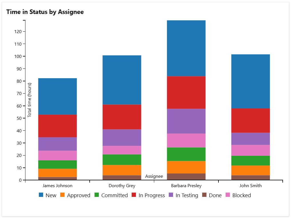
The Time In Status widget shows how long items stay in each workflow state, state category, or board column, helping you understand workflow and team efficiency, identify bottlenecks, and identify areas of the workflow that need optimization.
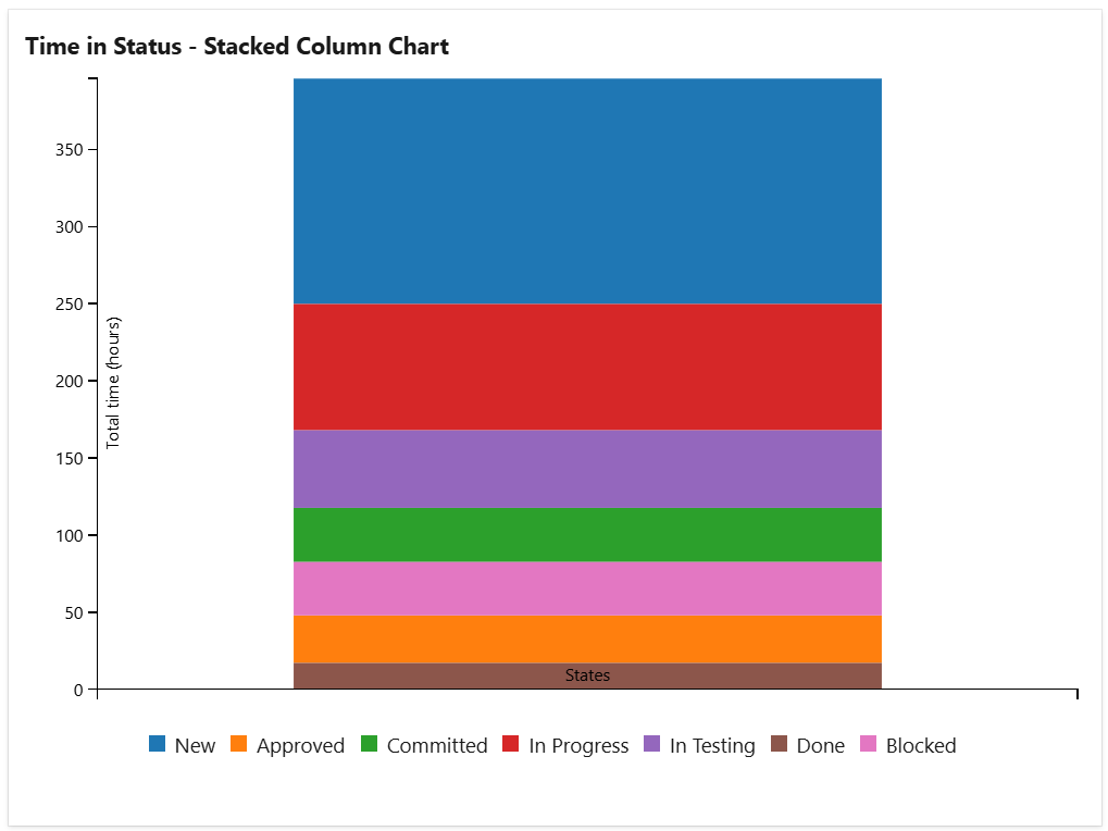
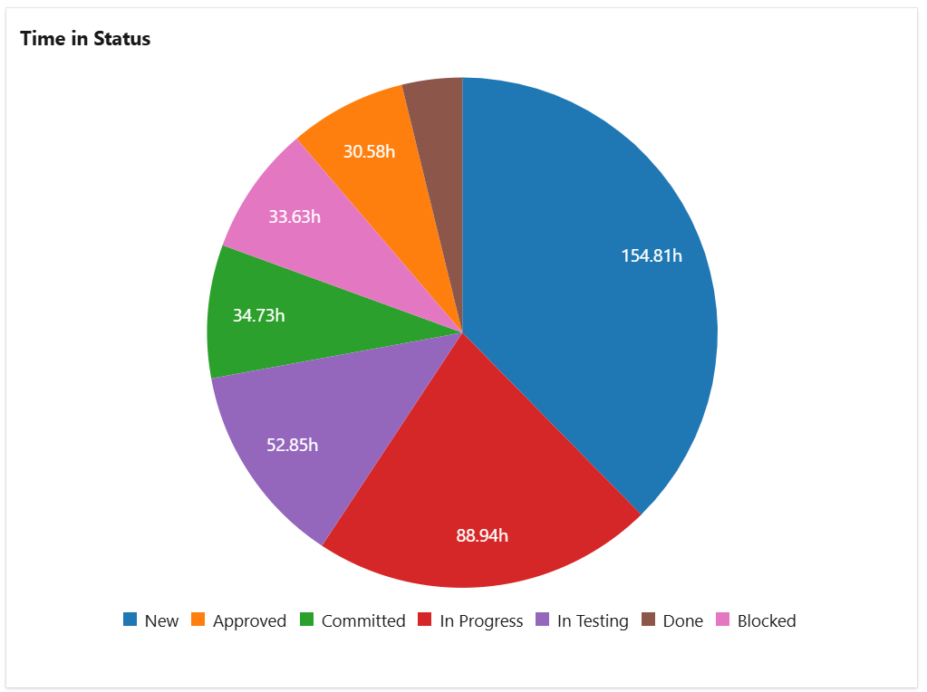
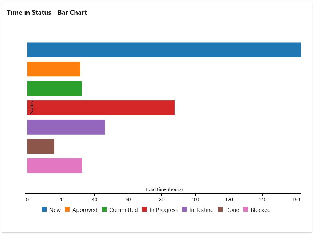
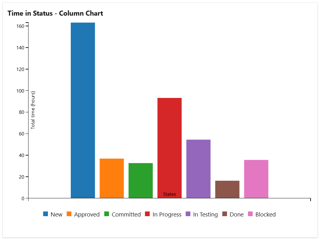
You can choose to display either the total time or the average time, and group the data by various criteria such as assignee, project, or priority. The results can be visualized as a pie chart, bar chart, column chart or stacked column chart, depending on your preference.
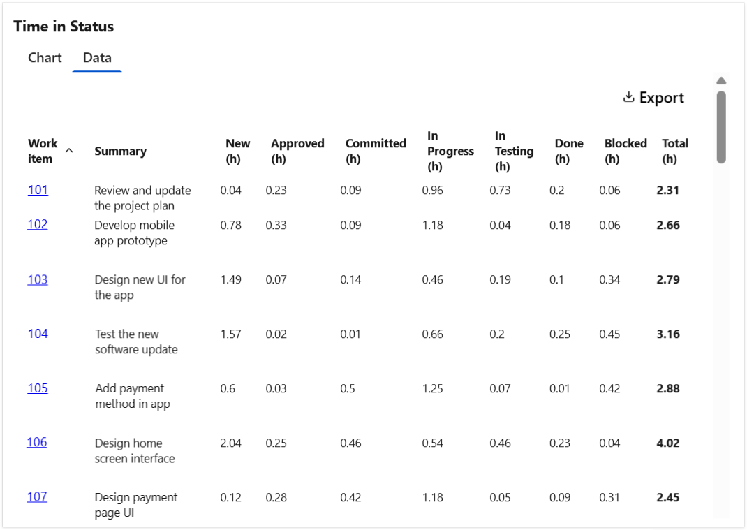
The widget can display a Data tab with detailed information about each item and the time in the states reached during their life-cycle. This data tab can be easily exported in CSV format for further analysis or reporting.
Configuration
The settings of this widget are divided in multiple tabs:
-
Data tab - contains the required settings of the widget, such as title or data source
-
More Settings tab - contains the optional settings
-
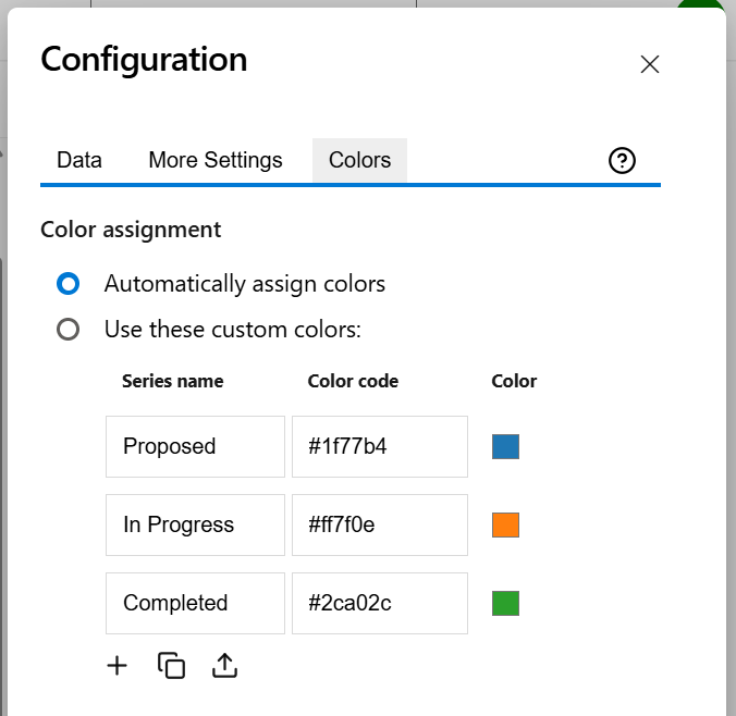
Colors tab - lets you customize the color of the lines displayed in the chart
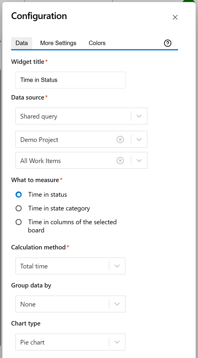
Data tab
On this tab you can configure the required settings of the widget.
|
Setting |
Description |
|---|---|
|
Widget title |
Choose what to display in the title bar of the widget. |
|
Data source |
Select the type of Data Source used by the widget:
|
|
What to measure |
Choose what you want the widget to measure. You can chose between:
|
|
Calculation method |
Indicates how calculate the time. You can choose between:
|
|
Group data by |
Optionally, you can choose to group the data by an item field, such as Assignee, Work Item Type, or Priority, of your choice. |
|
Chart type |
The type of the chart to be displayed by the widget. If Group data by is set to None, you can choose from Column chart, Bar chart, Pie chart, or Stacked column chart. Otherwise, you can choose either Stacked column or Stacked bar. |
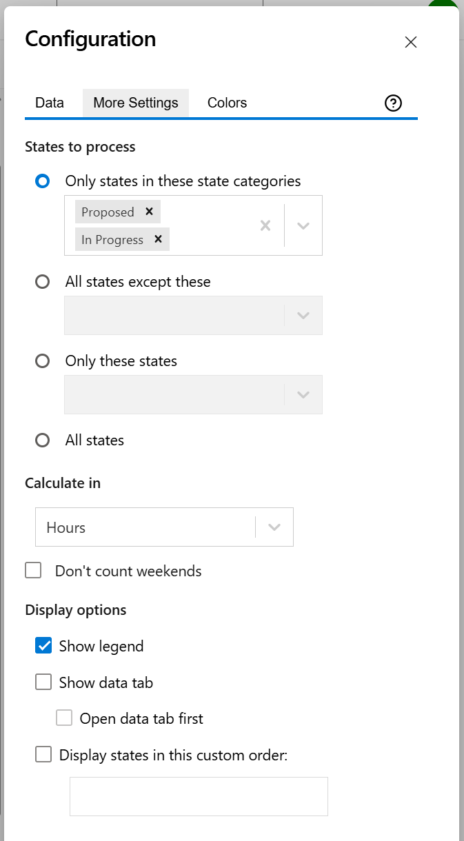
More Settings tab
On this tab you can configure the optional settings of the widget.
|
Setting |
Description |
|---|---|
|
States to process |
Specify what states to be processed. You can choose one of the following options:
|
|
Calculate in |
Choose the time unit in which the results will be displayed. |
|
Don't count weekends |
Check this option if you want to exclude the weekends (Saturdays and Sundays) when calculating the time in state. |
|
Show legend |
Check this option if you want the chart legend to be displayed. |
|
Show data table |
Check this option if you want a data table to be displayed along with the chart. The Data tab displays the items along with time in every state, state category or column of board depending on what you selected at What to measure on Data tab. |
|
Open data tab first |
Check this option if you want the widget to open on the Data tab first (instead of Chart tab as default). Note that the tab order will remain unchanged (Chart, then Data); only the initial view will switch to the Data tab. |
|
Display states in this custom order |
Choose the order in which you want the states to appear. This lets you control how they are displayed in the widget. |
Colors tab
On this tab you can customize the color of the lines displayed in the chart.
|
Setting |
Description |
|---|---|
|
Automatically assign colors |
Check this if you want the chart to automatically assign colors for the series. |
|
Custom colors |
Select any custom color you want the series to be displayed on by either entering the color's hexadecimal code or picking a color. By default, only the common series are listed, but you can use the Add (+) button to add additional series to the table. You can also use the Copy and Import buttons to copy and import the color configuration to widgets of the same type. |