
Overview
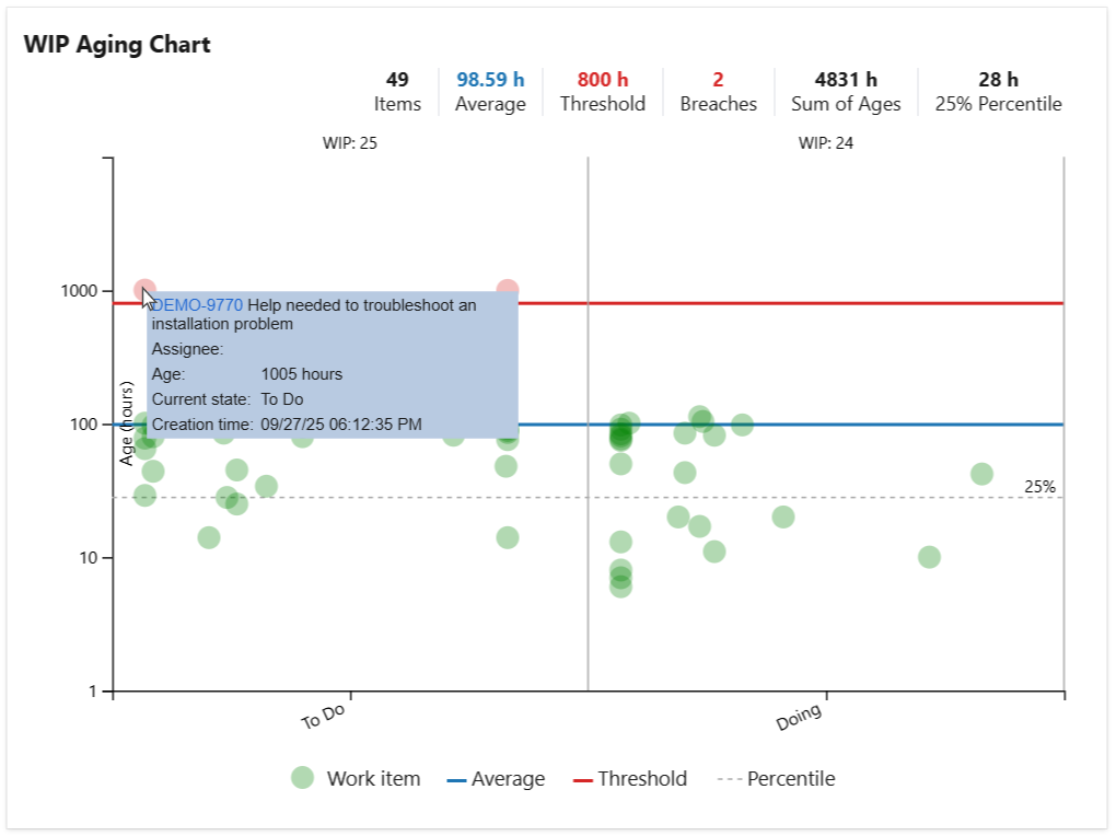
The WIP Aging Chart displays active work items by their age, calculated as the time since creation or since entering the current state or board column. It helps you easily identify work items that have been in progress for too long and those that have breached or are about to breach the SLA target.
The chart can optionally display percentile lines or an average line, and a custom threshold line can be added to quickly highlight items whose age (time in state or time in column) exceeds a defined maximum.
Hovering over an item in the chart shows a tooltip with item details such as the summary and age. When configured to display agile board columns, the widget also shows board WIP limits and visually highlights columns where those limits are exceeded.
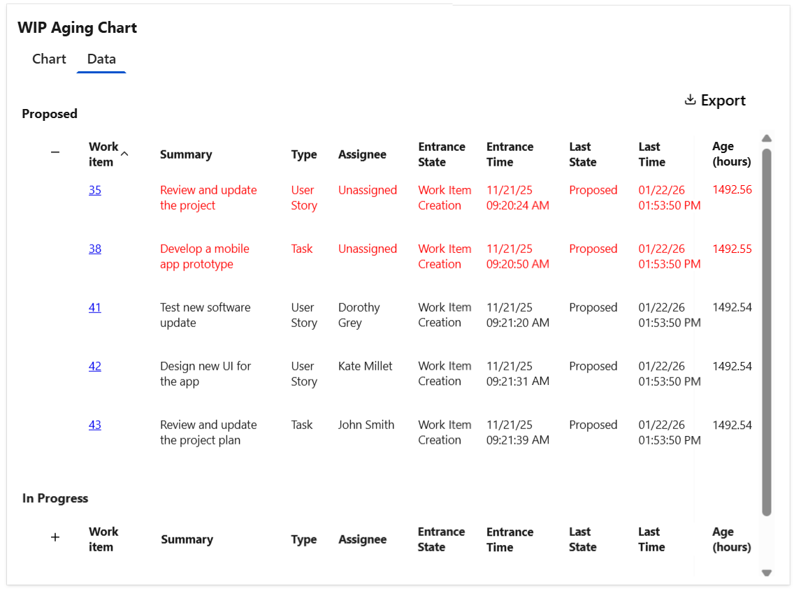
Optionally, the widget can display a Data tab with detailed information for each work item shown in the chart, which can be easily exported as a CSV file.
Configuration
The settings of this widget are divided in multiple tabs:
-
Data tab - contains the required settings of the widget, such as title or data source
-
More Settings tab - contains the optional settings
-
Colors tab - lets you customize the color of the lines displayed in the chart
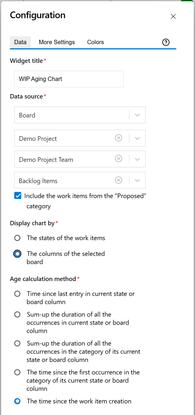
Data tab
On this tab you can configure the required settings of the widget.
|
Setting |
Description |
|---|---|
|
Widget title |
Choose what to display in the title bar of the widget. |
|
Data source |
Select the type of Data source used by the widget:
|
|
Display chart by |
It indicates what the chart displays on its horizontal axis and how the items are grouped in the chart:
|
|
Age calculation method |
Specify how the age is calculated by choosing one of these options:
|
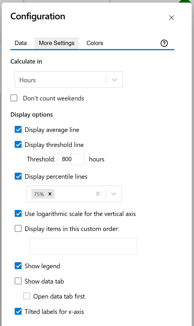
More Settings tab
On this tab you can configure the optional settings of the widget.
|
Setting |
Description |
|---|---|
|
Calculate age in |
Choose the time unit in which the age of the work items will be displayed. |
|
Don't count weekends |
Check this option if you want to exclude the weekends (Saturdays and Sundays) from the age calculation. |
|
Display average line |
Check this option if you want the chart to display a line with the average age for all the items displayed in the chart. |
|
Display threshold line |
Check this option if you want the chart to display a line representing a threshold. The items that have an age higher than the specified Threshold value will be colored in red. |
|
Display percentile lines |
Select this option and enter the values (percentages) for the percentiles you want to display. A percentile is a value that divides the data set into two parts: the lower part contains the specified percentage of the data, and the upper part contains the remainder. For example, the 75th percentile will appear as a horizontal line with 75% of the items below it and 25% above it. |
|
Use logarithmic scale for the vertical axis |
Check this option if you want the chart to display a logarithmic scale instead of a linear scale for the Y axis. |
|
Display state in this custom order |
Choose the order in which you want the state to appear. This lets you control how they are displayed in the widget. |
|
Show legend |
Check this option if you want the chart legend to be displayed. |
|
Show data table |
Check this option if you want a data table to be displayed along with the chart. The Data tab displays the items grouped by state or board column along with their age. |
|
Open data tab first |
Check this option if you want the widget to open on the Data tab first (instead of Chart tab as default). Note that the tab order will remain unchanged (Chart, then Data); only the initial view will switch to the Data tab. |
|
Tilted labels for x-axis |
Check this option to avoid overlapping labels on the x-axis. |
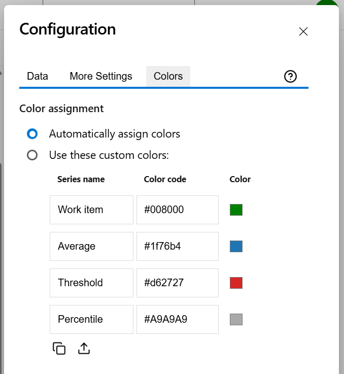
Colors tab
On this tab you can customize the color of the lines displayed in the chart.
|
Setting |
Description |
|---|---|
|
Automatically assign colors |
Check this if you want the chart to automatically assign colors for the series. |
|
Custom colors |
Select any custom color you want the series to be displayed on by either entering the color's hexadecimal code or picking a color. You can also use the Copy and Import buttons to copy and import the color configuration to widgets of the same type. |